Site-Wide Elements
Site-wide elements are the items that appear and are identical on every page. Site-wide elements are categorized into Header, Navigation and Footer regions.
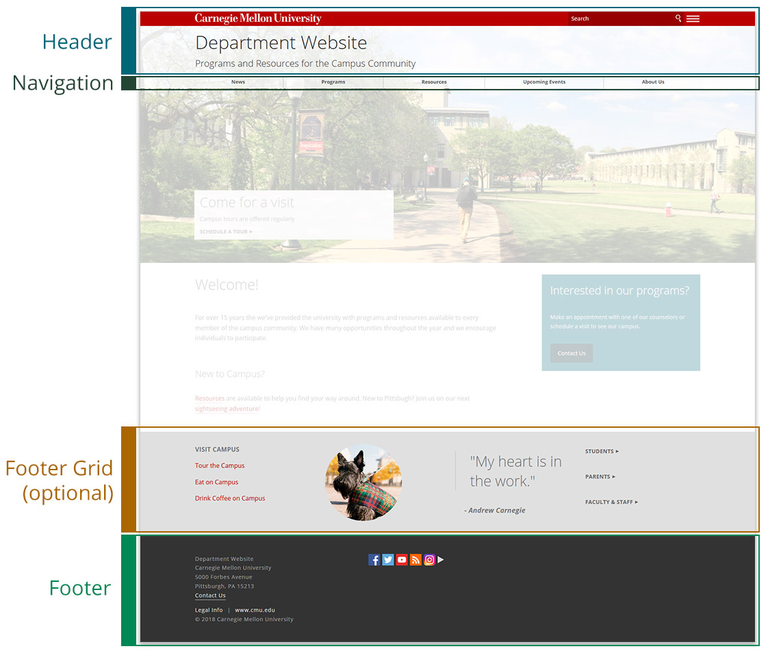
Header
The header appears at the top of every page. You may choose the color of the "roof" (the top-most bar with the university's wordmark) to be white, red or dark gray. In addition to the department or group name, configurable options are available for other elements.
Elements
- Carnegie Mellon University wordmark with clickable link to the university's home page
- Name of the department or group
- Parent organization or slogan (optional)
- Search box for site search or university-wide search
- Hamburger menu opens the side navigation
- Logo (optional)
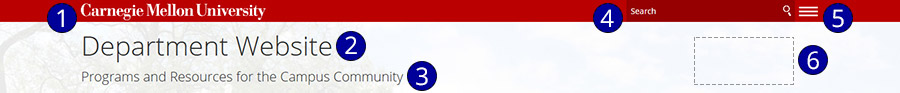
Navigation
Navigation provides the functionality to traverse a site using menus that are available on every page. Navigation is automatically generated as you build your site; however, configuration options are available for customization. Navigation is provided in several regions of a page.
Elements
- Top navigation spans the full width of a page and can accommodate up to 10 items
- Side navigation is a slide-out menu that is either open or closed per-page depending on several factors. It can be opened manually using the hamburger menu and closed using the X at the top right. The department or group name at the top is a clickable link to the site's home page. If a navigation item contains subpages, clicking on the arrow near the item will expand the menu
- The upper region, the primary area of the side navigation; it displays all items in the top navigation
- The secondary area of the side navigation, the lower region; it is an optional feature and ideal for featuring complementary or supporting information
- Breadcrumb links are provided to reference your location on the site in relation to the home page
Footer Grid (optional)

The footer grid appears near the bottom of every page immediately above the lower footer. It is ideal for providing content that is easily accessible throughout your site, such as important links.
Elements
- Select 2-4 columns
- Each column may be a WYSIWYG (an open content area for text, media, images and more) or a list of links
- Choose a background color of red, gray or dark gray
Footer

The footer is the bottom-most region of every page. Configurable elements include contact information and social media.
Configure the footerElements
- Department or group name and customizable contact information including address, phone and email
- Links to legal information, the university's home page and copyright year (not configurable)
- Social media links (optional)