The effective use of any technology in teaching requires thoughtful consideration and planning. Whether low tech (a chalkboard) or high tech (a 3-D interactive visualization), a tool’s learning benefits depend on when, where, how, and why you use it. We can help you find a tool or set of tools that align with your goals, and provide you support as you select and integrate solutions effectively into your teaching.
Want to find out more about, explore, or try out a particular tool that might meet your goals?
CONTACT US to talk with an Eberly colleague in person!
In this section, you’ll learn the answers to these questions:
What are information visualization tools?
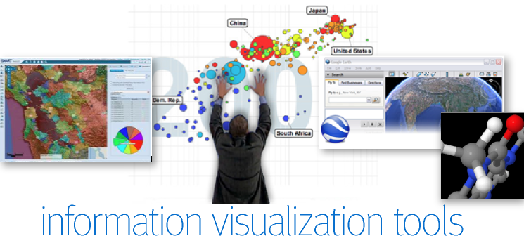
The term “information visualization tools” refers to a broad range of digital tools and resources that allow users to view, analyze, manipulate, and/or communicate complex information, such as historical, spatial, and statistical data.
Information visualization tools range from freely available tools that produce simple visual representations of small data sets to proprietary tools that can manipulate complex data.
Here are some tools that have been used by Carnegie Mellon faculty:
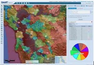 |
Geographic Information Systems (GIS) allows users to capture, manage, analyze, and display geographically referenced information. |
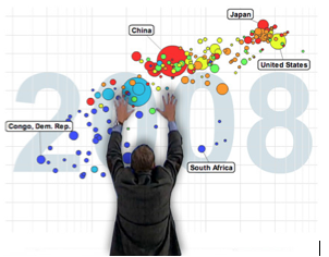 |
Gapminder.com represents statistical data in graphically dynamic ways. |
 |
JMOL allows users to view the chemical structure of molecules in 3-D. |
 |
Google Earth allows users to view geographical space from different angles and distances through the use of superimposed satellite imagery. It also allows users to import publicly available datasets and map them geographically. |
There are many other information visualization tools that you can explore. Contact us if you’d like help or suggestions.
What learning objectives can be achieved with particular tools?
Instructors incorporate information visualization tools into their teaching for different reasons. If the tool is widely used in professional practice, teaching students how to use it may be a practical skill in itself and even the focus of an entire course.
Instructors may also enlist information visualization tools to accomplish other learning objectives. These range from helping students analyze the merits and potential uses of visual representations created by others to asking students to develop visual representations of their own.
Here are some objectives that instructors have targeted using information visualization tools.
Objective: Compare and evaluate different techniques of visual representation.
To challenge students to think creatively about mapping conceptual and physical space, an architecture professor refers students to a set of design websites—including www.benfry.com, www.radicalcartography.net/?wikihist, www.densitydesign.org — where they browse creative visuals and think about different ways of representing data and ideas. She then uses these models to prompt discussion in class and push students to be creative in their own work
An English professor wants students to consider how different types of visualizations (e.g., Gantt charts, cartoons, Venn diagrams) serve rhetorical purposes and can be enlisted to support a persuasive argument. He shows students the online Periodic Table of Visualizations where they view and discuss the effectiveness of different visual representations of data in relation to audience, purpose, and genre.
Objective: Describe and analyze trends.
A public policy professor wants students to describe and analyze global demographic trends along social, political and economic dimensions. She uses an online statistics visualization tool (Gapminder) to help students examine changes over time (e.g., life expectancy as a factor of income between the 19th and 20th centuries) and hypothesize reasons for these changes.
A history professor wants students to discuss how the boundaries and organization of cities changed as a result of different waves of migration. To accomplish this, he accesses historical maps of Chicago on Google Maps and asks students to research and analyze the national and international events that contributed to changes in urban space.
Objective: Create persuasive visual representations to support an argument or recommendation.
A health policy instructor wants students to assess whether clinics in Pittsburgh are distributed adequately to meet the needs of specific populations. She asks students to use Geographic Information Systems (GIS) and Google Maps to identify the location of health providers in Pittsburgh relative to vulnerable populations, public transportation, and other factors in order to evaluate their sufficiency and make policy recommendations.
An anthropology professor wants students to incorporate sensory data into ethnographic analysis. To raise students’ awareness of the sensory experience of urban life, she asks them to use Geographic Information Systems (GIS) and Google Maps to produce a “sound map” of their city based on audio files they collected on mobile devices while walking through different neighborhoods. Students are then asked to analyze their sound maps in relation to the ethnic makeup and economic activities of these neighborhoods.
Objective: Develop mastery with a specific tool.
A biology professor wants students to develop proficiency with JMOL, an applet chemists and biologists use to study and present molecules in 3-D. He offers an intensive tutorial with JMOL at the beginning of his course and requires students to use the tool regularly as they learn about molecular biology.
An architecture professor wants students to gain pre-professional experience using Geographic Information Systems (GIS). She teaches an entire course in which students take a series of GIS tutorials and then apply their skills on assignments that ask them to create and analyze geographical mappings of public buildings.
How do I know if a particular tool is appropriate for my course?
Before adopting an information visualization tool, ask yourself whether it supports your learning objectives for the course and whether it is feasible and appropriate given your students, constraints, and context.
Learning objectives: Consider your learning objectives for the course or assignment.
- What intellectual skills and/or technical competencies do you want students to develop?
- Will a particular information visualization tool help students meet these learning objectives?
- Would another tool be more appropriate?
- How can you structure the course or assignment to ensure that your learning objectives are reached?
Students: Think about who your students are.
- Do they have the technical skills to learn the tool in the time available?
- Will they be able to use it effectively to accomplish the objectives of the assignment?
- Do your students represent majors and intended professions for which the tool is relevant?
Constraints: Think about your constraints.
- Will you have sufficient time to teach the tool?
- Will students have time to develop facility with the tool before using it for high-stakes assignments? (This may be a challenge in a mini-course, for instance.)
- Will you have the resources (computer lab space, software, etc.) you need?
Context: Think about the context in which the tool will be used.
- If you employ other digital tools in your course, will adding this one create an unnecessary cognitive burden, or will it complement other technologies?
- If this tool or tools like it are used in other courses in the curriculum, how will that affect whether or how you introduce the tool under consideration?
Contact us to talk with an Eberly colleague in person!
What are the tradeoffs of using the tool in my course?
The adoption of any tool entails tradeoffs. For example, think of a calculator. While it allows students to calculate quickly and thus to do more complex problems, it obscures some steps in solving problems. Is the tradeoff an acceptable one?
Instructors will assess tradeoffs differently, depending on their objectives for student learning and standard practices in their professions, but here are some potential tradeoffs to using information visualization tools.
Information visualization tools generally automate processes that would otherwise be performed more slowly and painstakingly. This has disadvantages as well as advantages. For example, if a tool allows students to map an area using satellite photographs instead of drawing by hand, some experiential aspects of the assignment may be lost. However, students may be able to tackle more ambitious projects. Similarly, tools that instantly generate graphs or diagrams may conceal analytical processes that are important for students to understand. But by offloading these processes, they may also allow students to focus on other cognitive dimensions of the assignment.
Other tradeoffs involve the allocation of time and energy: your own and your students. Incorporating a new tool into your course may take extra time and effort in preparation, in the classroom, and during office hours. However, if students’ learning gains are significant or if you innovate teaching approaches that contribute to your department or discipline, it may be worth the investment. Making room in a course to introduce, practice, and use a new tool may also require that you give up other content you value. Again, this may or may not be worth it to you, depending on how you weigh the gains and losses.
What are some possible pitfalls — and strategies to mitigate them?
Information visualization tools can be powerful teaching resources, but they will not enhance learning automatically. Here are some potential pitfalls to keep in mind, along with some strategies for addressing them.
| PITFALL | STRATEGY |
| Instructor focuses on the technical capabilities of a tool and loses sight of the learning objectives. | Structure the assignment to reinforce the learning objectives. Think hard about your goals for a course or assignment, and design the material so that students must demonstrate learning in these areas. Make sure your performance criteria are consistent with these objectives as well. If you find you are having trouble reconciling the tool with your learning objectives, consider dropping the tool or looking for a more appropriate one. No matter how powerful or well-designed a tool is, it doesn’t belong in the course if it isn’t supporting student learning. |
| Instructor assumes that since students are familiar with the web, they will automatically know how to use digital tools. | Provide guidance on how to use tools. Don’t assume that students who are savvy in some aspects of computer use can easily learn and use digital tools. Provide guidance on how to use a new tool, whether by demonstrating it in class, pointing students to an online tutorial, or providing your own instructions. |
| Instructor underestimates the time it will take students to develop fluency with the tool. | Give students practice with the tool before applying it to complex tasks. When students are trying to learn two things at once (e.g., how to use a new tool as well as how to analyze data), their learning and performance often suffer because their attention is divided. Thus, it is important when teaching a new tool—especially a complex one—to allow time for students to practice using it. Make sure they have enough time not only to learn the tool, but also to gain fluency with it before tackling complex problems. |
| Instructor doesn’t anticipate potentially time-consuming problems. | Factor in time for unanticipated problems. When planning and scheduling assignments, think about logistical and technical problems students might encounter. Warn students about potential trouble spots (e.g., non-intuitive aspects of the interface, limited access to computer clusters) and hidden steps (e.g., configuring a personal computer, acquiring necessary software). Make sure students have access to the resources and technical support they need, as well as the time to address problems as they arise. Using the tool yourself can alert you to various pitfalls (e.g., paucity of relevant data, idiosyncratic features). You can also ask a teaching assistant to help you troubleshoot. |
| Instructor assumes students understand what they’re seeing in visual displays. | Ask students questions to probe their understanding. Instead of assuming that students can “read” graphic representations of information, ask questions that require them to describe, explain, and reason about what they are seeing. For example, an instructor using the visually rich Gapminder.com website might ask students questions such as: What do these circles represent? Why are they different sizes? What do the colors indicate? Why are they moving up as we approach the 20th century? How would you describe the trend you’re seeing? |
| Students focus on peripheral aspects of the assignment rather than the main tasks. | Focus students’ attention on the learning objectives of assignments. Clearly articulate your expectations and priorities for an assignment (e.g., “I am interested in your analysis of demographic patterns, not the number of photos you attach to your map”) so that students focus on the key intellectual tasks and aren’t distracted by the tool’s other capabilities. Explicitly distinguish the key components of the task—for example, “create a map that clearly illustrates patterns of violent crime in the city, write a report in which you explain these patterns in terms of public policy, and provide three policy recommendations”. Clarify your priorities via the breakdown of points for the assignment (e.g., 80 points for data analysis and explanation; 20 points for visuals). |
| Instructor assumes students have data analysis or design skills that they lack. | Do a prior knowledge assessment. Rather than assume that students have the skills they’ll need for a particular assignment, make sure they do. One way to do this is to conduct a prior knowledge assessment early in the semester. If you find that students lack important prerequisite knowledge or skills, there are a number of ways you can respond. Depending on the scale of the problem, you can designate class time to teach and reinforce the missing skills, provide remedial sessions outside of class time, or (if it is only a few poorly prepared students) discourage poorly prepared students from taking the class. |
| Students do not approach the data with a sufficiently critical eye. | Encourage critical thinking about data. When you employ tools that represent complex data sets (e.g., census data, World Health Organization statistics), ask students to think critically about the nature and limitations of the data itself. Where did it come from? How were variables defined? How did methods of data collection influence what is and isn’t included? (For example, you might ask students what portions of the population are under-represented in census data and why.) You can also create assignments that emphasize divergent interpretations of data. For example, if you ask students to use Google Earth to create a “fair trade map” of South America, you might require that the map reflect different perspectives on the definition of “fair trade.” |
| Students do not approach visuals with a sufficiently critical eye. | Encourage critical thinking about visual representations. When students are asked to view or produce different visual representations of data (e.g., pie charts, pictograms, word clouds, bar graphs), encourage them to discuss what different modes of visual representation communicate and obscure. If students are creating visual representations of their own, ask them to reflect on how the visuals support their goals, speak to particular audiences, and accomplish other tasks. |
| Instructor assigns group projects, thinking it will be more efficient. | Recognize the added burdens of group work. Rather than reducing the amount of work students must do or enabling them to work faster, group work generally adds an additional and different set of complications, because it requires students to coordinate their schedules and integrate their work. It also requires a different set of skills than working individually, such as reconciling differences, synthesizing perspectives, communicating effectively, and delegating. Because students’ success is tied to other students’ efforts, it can be stressful. Group work is a complex pedagogical issue in its own right that requires careful thought and planning. When combining it with other complexities, such as new technologies, plan carefully. |
| Students do not see the relevance of a particular tool to their discipline (e.g., a mapping tool in an English class). | Highlight the relevance of the tool to issues and themes in your discipline. Rather than assume students will understand why you are asking them to use a particular tool, explain its applicability or ask students to make these connections themselves, using questions such as “Why is this mapping function useful to an anthropologist?” and “Why would a statistician want to be able to represent the same data in different ways?” |
| Students get frustrated learning a tool that they don’t see any long-term use for. | Weigh the overhead of learning a new tool against its benefits. Consider whether there is sufficient payoff for students to balance the overhead (time, energy, effort) of learning a new tool. Are they likely to use it in future courses or projects? Is the learning benefit of using it significant? Is the tool widely used in your discipline or profession? If the benefits outweigh the costs, highlight these benefits to students. But if the costs outweigh the benefits, you might want to rethink incorporating the tool. |
How can I assess student learning and performance?
Assessing an assignment that involves information visualization tools is no different from assessing student learning in any other context. It requires that you clearly identify measurable, student-centered learning objectives (e.g., students will be able to map publicly available demographic data and explain the limitations of that data) and assess students’ performance in relation to those objectives.
Assessment can be informal, immediate, and low-stakes. Examples include asking questions to test students’ comprehension and reasoning or giving them a short reflective writing exercise in class (e.g., what did you learn about the relationship between poverty and AIDS from this Gapminder display?). Assessment can also be formal and high-stakes, in the form of graded papers, presentations, and projects.
When assessing assignments that involve information visualization tools, it is important to identify performance criteria. How will you evaluate work that is visually stunning but analytically weak? Or analytically strong and visually weak? It depends, of course, on your objectives and priorities for the assignment. You can weigh one element more heavily than the other or both equally. What’s important is that your performance criteria are clearly articulated and consistently applied. One effective way to do this is by creating a performance rubric that articulates your criteria to students.
If you are unsure what performance criteria to use to assess visuals, one thing that can help is to study successful visualizations within your own profession (in print or on disciplinary websites) and identify the features you would like to see in student work. Websites devoted to visual design can also help you identify relevant features of effective visual presentations.
Assessing student learning will provide you with feedback you can use to make improvements to the next iteration of your course. For example, if you find that students are not sufficiently analytical in their use of a tool, or that they fail to apply the principles from readings or lectures, you might structure future iterations of the assignment to emphasize those skills. Remember, nobody gets it exactly right the first time. Be patient with yourself, and pay attention to what works and doesn’t work when you try a new tool, so you can refine the material over time.
If you would like help designing appropriate assessments, articulating performance criteria, and/or assessing your own teaching, contact the Eberly Center.
Eberly Center
4765 Forbes Avenue
Tepper Quad, Suite 1310
Pittsburgh, PA 15213
(412) 268-2896
Contact Us
![]()
![]()
![]()
![]() This work is licensed under a Creative Commons Attribution-NonCommercial-ShareAlike 4.0 International License.
This work is licensed under a Creative Commons Attribution-NonCommercial-ShareAlike 4.0 International License.