Exploring the Fundamentals of Interaction Design
Turning Everyday Interactions into Seamless Experiences
By Phil Geist
At the heart of every innovative product lies a user-centric design philosophy that doesn’t just focus on what a product does, but how it feels to use it. This is where Interaction Design plays a vital role by examining the patterns and behaviors users exhibit. It’s not just about function, but about crafting experiences that are intuitive, enjoyable, and effective for the user.
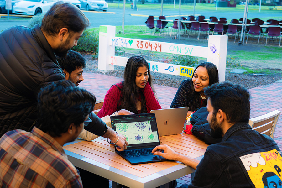
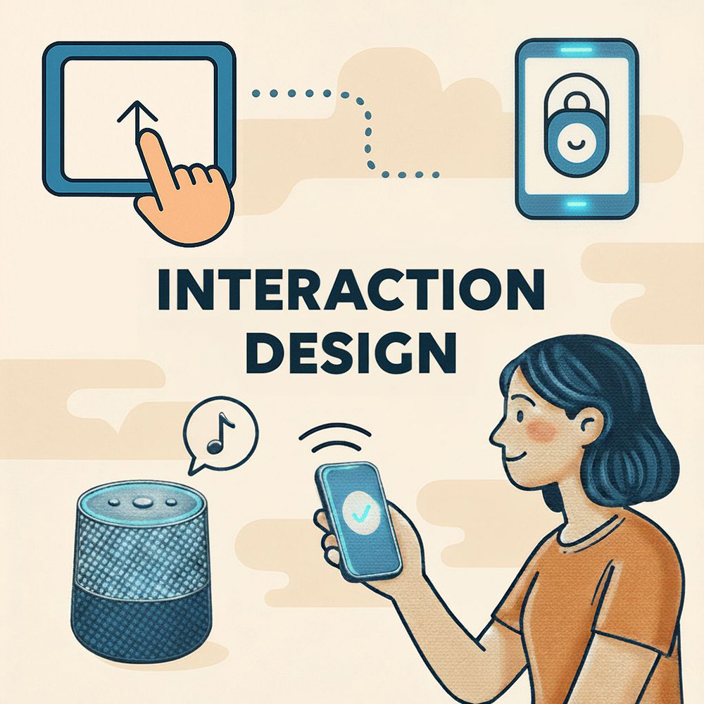
Whether we’re talking about unlocking a phone with your face, transferring data between devices with a single tap, or asking Alexa to play your favorite song, good interaction design is often invisible—it just works. But behind that simplicity is a thoughtful, rigorous process focused entirely on how users interact with technology. This past spring, Professor Shyamala Prayaga taught Human-Computer Interaction & User Experience Design for Managers, a course that equips students with a foundational understanding of Interaction Design.

What is Interaction Design?
Interaction Design (IxD) aims to make user experiences more effective and enjoyable. It’s about designing systems and interfaces that are stress-free, seamless, and even delightful to use. When done right, users don’t just use a product; they return to it, rely on it, and even recommend it to others.
Professor Shyamala Prayaga explains it simply: “If a customer is excited and delighted, they will come back.” That repeat engagement—whether it’s through time spent, returning visits, or repeat purchases—is a powerful measure of success in interaction design. Instagram, PlayStation, and Spotify are prime examples of enjoyable products that users return to again and again.
Measuring Customer Delight
A common question from students in product management and design is: How do you measure customer delight? While it’s a qualitative concept, there are clear quantitative signals—like increased usage, customer retention, and recurring transactions. These signals show positive customer experience within a product because of repeat or increased interactions. Think about how many people switch to an Apple device and never look back. That kind of loyalty stems from a well-crafted, intuitive user experience.
Goals of Interaction Design
Interaction design focuses on several key goals, each essential to creating user-first experiences:
Effectiveness:
Can users complete their tasks accurately and successfully? A product must enable users to achieve their goals within a reasonable amount of time. Whether it’s making a purchase or filing taxes, effectiveness is about how fast you can complete the transaction.
Efficiency:
Users should be able to complete tasks quickly and with minimal effort. Consider the password reset process—while it may seem simple, it must be thoughtfully designed to reduce user frustration while maintaining security.
Safety:
Products must minimize the risk of user errors and provide clear paths for recovery. This not only protects user data but also builds trust. A well-designed interface allows users to undo actions or recover from mistakes with ease.
Utility:
A product should offer only the features and functions that users need—nothing more, nothing less. Think about a TV remote—how many buttons does it really need? Overcrowding it with unnecessary functions leads to confusion. Utility is about making smart, minimalist design choices that keep the average user in mind.
Learnability:
Great design helps users become self-sufficient. Whether it’s a new app or a smart home device, the product should be intuitive enough for users to learn and use on their own. Professor Prayaga illustrated this concept with a personal story about teaching her mother how to heat milk in the microwave. She reinforced the importance of making users feel comfortable, which in this case meant helping her mother feel confident using her specific microwave model. Thoughtful, user-centered design simplifies the learning process and leaves people feeling capable and empowered.
Memorability:
Once users learn how to use a product, they should be able to recall that knowledge easily. Memorable design fosters familiarity and reduces the need for repeated training.
Simplicity:
Simple designs lead to better user experiences. For instance, transferring apps and settings from an old iPhone to a new one should feel seamless. Simplicity means removing friction—making the experience so intuitive that users can interact with a product effortlessly.
User Experience Enhancement:
Great products don’t just work well—they also create moments of joy. Thoughtful details, like micro-interactions or playful features, can elevate the user experience. For example, when Alexa responds with a clever answer to a personal question, it can surprise and delight the user. These small, unexpected touches help make the experience more memorable, which in turn boosts both satisfaction and engagement.
Consistency:
Familiar patterns help users anticipate how a product will behave. Usability testing ensures that the interface aligns with user expectations. Using consistent fonts, colors, and icon styles creates a unified experience that reinforces trust and usability.
Exploring Types of Interaction
As technology evolves, so do the ways we interact with it. Voice user interfaces (VUIs), like those found in smart speakers such as Alexa, allow users to speak commands and receive spoken responses, offering a convenient, hands-free experience. Graphical user interfaces (GUIs) remain the most familiar; buttons, icons, and touchscreen gestures form the backbone of most digital products.
Command-line interfaces (CLIs), though more specialized, are still common in technical environments where typed commands offer precise control. Another intuitive method of interaction is direct manipulation—like dragging a file into a specific folder like the trash can—which mimics real-world physical actions to help users feel more connected to on-screen behavior.
Multimodal interfaces combine multiple input types, such as voice, text, and visuals, to create flexible and adaptive user experiences. This points to the future of interaction: systems that can understand and respond across different channels. Similarly, natural language interfaces—like ChatGPT—use conversational language to allow users to ask questions and receive thoughtful, context-aware responses.
The Seven Stages of Action
The Seven Stages of Action is a framework developed by cognitive scientist Donald Norman to describe the process users go through when interacting with products or systems. This model is fundamental in understanding how to design user-friendly interfaces that facilitate smooth interaction.

A simple example of the Seven Stages of Action in practice is deciding what to eat for dinner. The process begins when the user forms a goal—determining whether to go out to eat or cook at home. After deciding to cook at home, the user forms an intention, such as choosing a specific recipe. To carry out this intention, the user opens a recipe app and searches for something like “chicken recipe.” The system responds with a list of options, which the user perceives and explores. The user then interprets this information, considering factors like ingredient availability. Finally, the user evaluates their outcome and confirms that it aligns with the original goal of deciding what to eat for dinner. Professor Prayaga expressed, "When you are designing for interaction, you have to keep these seven stages of action in mind."

Professor Prayaga talks with students about The Seven Stages of Action
The Five Dimensions of Interaction Design
When interacting with any digital product or application, everything you see, touch, or experience on the screen is a reflection of its interaction design. These experiences are shaped by five key dimensions:
-
Words – the text that conveys meaning
-
Visual Representations – the graphics and imagery that support and enhance the message
-
Physical Objects/Space – the hardware and layout that enable interaction
-
Time – the sequencing and pacing of interactions
-
Behavior – the user’s actions and the system’s responses
Together, these dimensions form a cohesive interaction system that influences usability, accessibility, and overall user experience.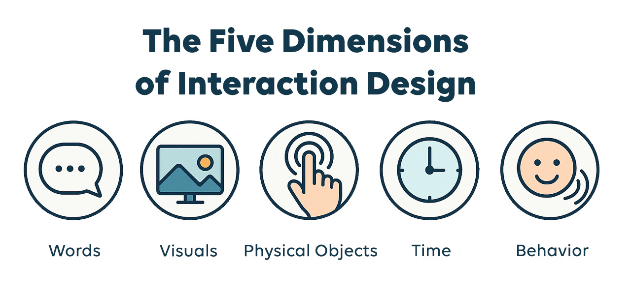
 First Dimension – Words
In UX design, words are more than static text—they are the primary means of conveying meaning, instructions, and intent. This dimension focuses on word choice and tone, both of which shape how users understand and interact with a product. Much like the communication in a long-term relationship, tone adds clarity and emotional nuance, fostering trust and ease of use.
Use familiar, straightforward language that resonates with your target audience. Avoid technical jargon that might confuse or alienate users. Prioritize clarity and consistency—select terms that accurately reflect functionality and stick to them throughout the interface. For example, choose either “Page not found” or “404 error” for a broken link, and use that terminology consistently. A clear, approachable tone can make a product feel more intuitive and welcoming.
 Second Dimension – Visual Representations
Visual representations include all graphical elements users interact with—icons, typography, color, images, spacing, and layout. These elements serve as visual cues that support comprehension, usability, and emotional engagement.
Well-designed visuals reinforce branding, guide user behavior, and improve accessibility. For example, a trash can icon universally signals “delete,” while consistent use of color and visual hierarchy helps users prioritize tasks. Photographs, illustrations, and animations can establish mood, convey identity, or highlight important features. In all cases, visual elements should support the content and enhance clarity, not distract from it.
 Third Dimension – Physical Objects / Space
This dimension considers the physical devices and environment through which users interact with a product. It includes hardware like touchscreens, keyboards, mice, voice interfaces, or haptic feedback tools. In responsive or adaptive design, screen size and orientation also play a major role in shaping the user experience.
For example, designing a mobile app requires thoughtful placement of touch targets, like buttons or swipe areas, to ensure comfortable and accurate interaction on a smaller screen. Likewise, voice-activated systems must consider microphone placement and environmental noise. The design must accommodate the physical space and tools users are operating within, optimizing comfort and efficiency.
 Fourth Dimension – Time
Time refers to how interaction unfolds over time—animations, feedback speed, transitions between states, and the overall rhythm of interaction. It helps users understand cause and effect, manage expectations, and feel in control.
For instance, a progress bar during a file upload reassures users that the system is working. Microinteractions—like a button briefly changing color when it’s hovered over, tapped, or clicked—provide instant feedback and confirm that the action was received. Timing also influences flow: too much delay between screens can feel sluggish, while transitions that move too quickly may disorient the user. Thoughtful use of time helps create a seamless and responsive experience.
 Fifth Dimension – Behavior
Behavior refers to both the user’s actions and the system’s responses. It encompasses interactions such as clicking, swiping, speaking, or selecting—and the outcome that results from those inputs. It also includes error handling, confirmation messages, and system behavior under different conditions.
In a digital checkout process, for example, the user enters their payment information (user behavior), and the system either processes the transaction or alerts them to an error, like an expired credit card (system behavior). Predictable, intuitive system responses help users achieve their goals efficiently and confidently. Behavior design also includes anticipating user intent and reducing potential errors before they occur. Good interaction design builds logical, helpful behaviors into every touchpoint.