Typefaces
With careful and consistent use, our primary typefaces, Open Sans and Source Serif Pro, will make our communications recognizable and distinctive. By choosing to download, install and use these fonts, you will ensure that your communications align to others throughout the university.
Optimized for print, web and mobile interfaces, with excellent legibility characteristics in its letterforms, Open Sans is available free for all mediums and performs well on both Windows and Macintosh operating systems.
Like Open Sans, Source Serif Pro is license-free and available on both Windows and Macintosh platforms. Source Serif is designed in the traditional style reflecting formality with idiosyncrasies that reveal a more unconventional nature. This typeface reads well in long copy at the middle weights and creates attractive headlines in varying weights.
When Open Sans and Source Serif are not available or practical (such as when sharing a live document outside of the university), substitute with Helvetica and Times respectively.
Open Sans
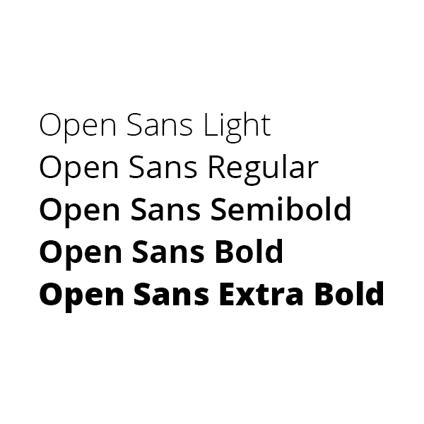
Open Sans comes in five weights (light, regular, semibold, bold and extra bold) and each weight is available in roman (upright) and italic. For accessibility on the web, weights should be limited to regular, bold and extra bold.
Source Serif Pro
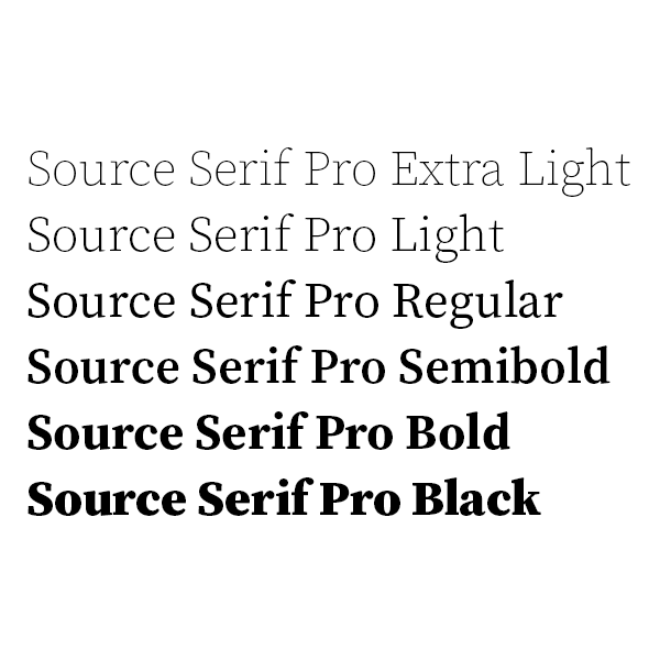
Source Serif Pro comes in six weights (extra light, light, regular, semibold, bold and black) and each weight is available in roman (upright) and italic.