Wordmarks, Lettermark, Unitmarks
Carnegie Mellon University has several marks or logos that provide quick identification of the institution and its units.
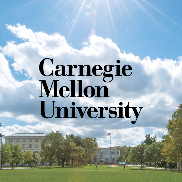
Wordmark
Role: The Wordmark is the primary identity element in our system. Our Wordmark functions as the official university logo, using only the words in our name and no other graphic elements. It is a unique expression of who we are.
Any public, official materials associated with the university — whether in print, online or around campus — must include the university Wordmark. Exception granted only when another official mark (i.e., Wordmark Square, Unitmark, Lettermark or Mascot Mark) is used correctly (see Unitmarks). The Wordmark should never lock up to or sit adjacent to another official university mark or any other school, college, unit name, icon or graphic.
The Wordmark has been crafted especially for the university. Therefore, it cannot be typeset and must only be reproduced using a graphic file (.eps and .png provided on the Downloads page).
The Wordmark can be rotated 90° (i.e., on the spine of a binder or shirt sleeve). Avoid curves, arcs or diagonal placement.
The word “University” is part of our official Wordmark. This is to clearly distinguish Carnegie Mellon University from other institutions or corporations who use “Carnegie” or “Mellon” in their names. As the university develops a strong global presence, this delineation is even more important. Never remove “University” from the Wordmark or modify to a shortened version.
Digital media occasionally requires variations to the minimum size and safe zones. If faced with these challenges, email University Communications & Marketing at marketing-info@andrew.cmu.edu for custom solutions or approval.
Minimum Size (Horizontal)
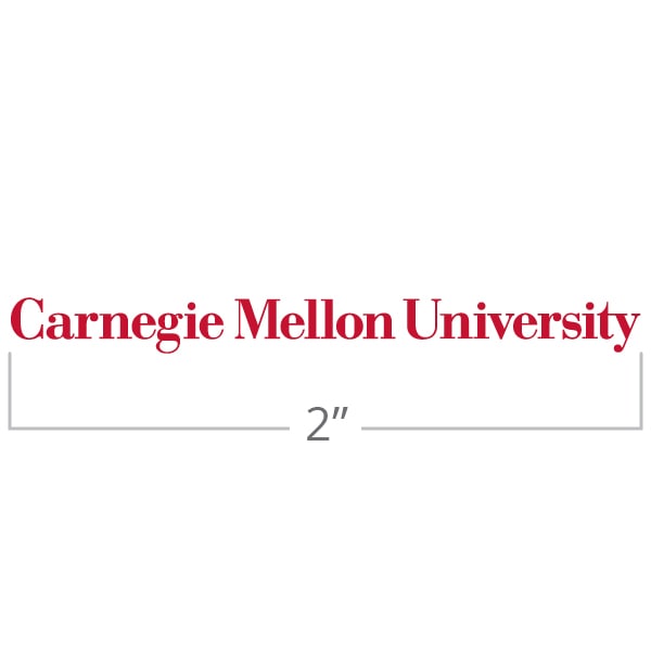
Never print the horizontal Wordmark less than 2 inches or 300 pixels wide.
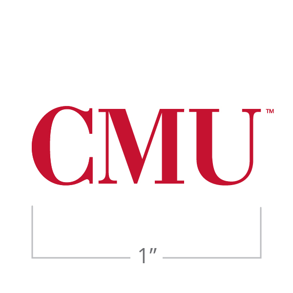
Minimum Size (Stacked)
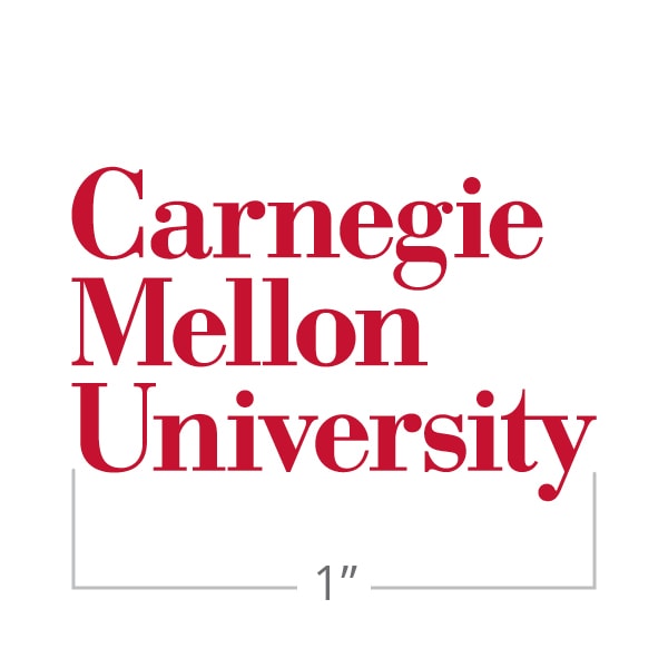
Never print the stacked Wordmark less than 1 inch or 150 pixels wide.
Safe Zone
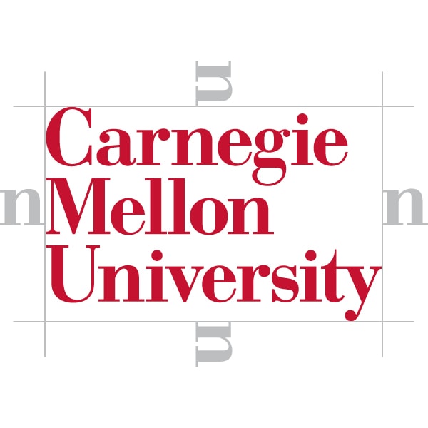
Leave at least 1 n-width buffer around the Wordmark.
Do Use "University"
Always include "University" in the Wordmark. This clearly distinguishes Carnegie Mellon University from other institutions who use "Carnegie" or "Mellon" in their name.
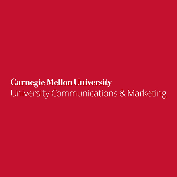
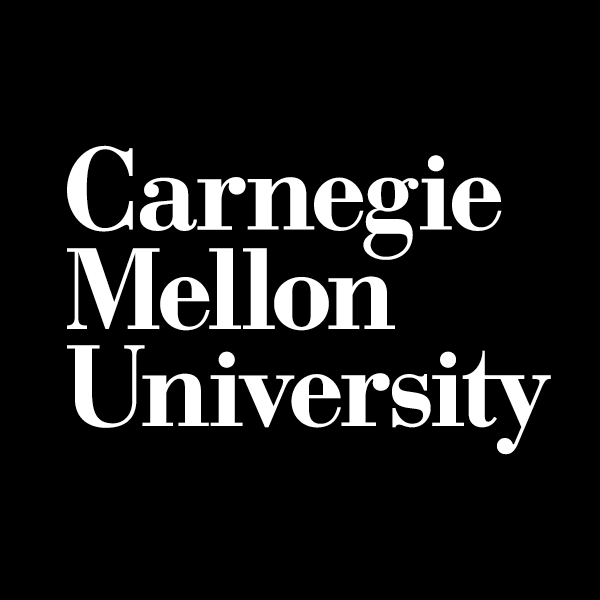
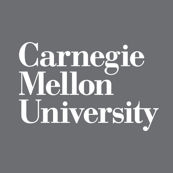
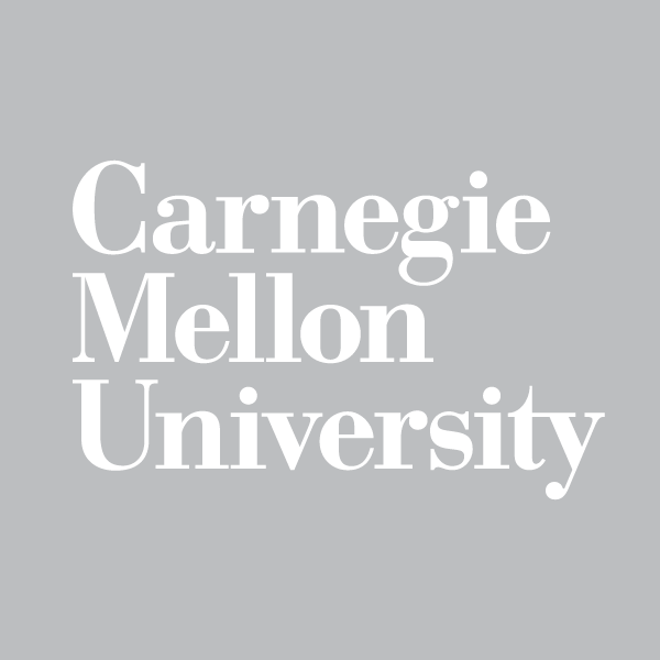
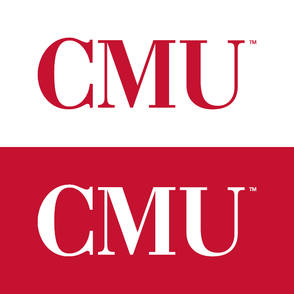
Acceptable Wordmark Colors
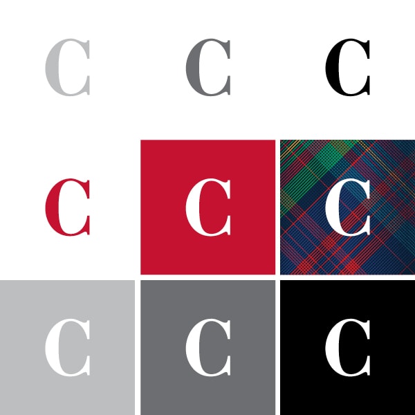
When using a white Wordmark, it can only be placed on the core colors and tartan.
Wordmark Combinations
When using a different core color Wordmark other than white, explore different core color combinations to achieve different tones for your audience.
The Wordmark must be legible when using a photographic or texture background. When in doubt, use the Wordmark Square on photography or texture for legibility.
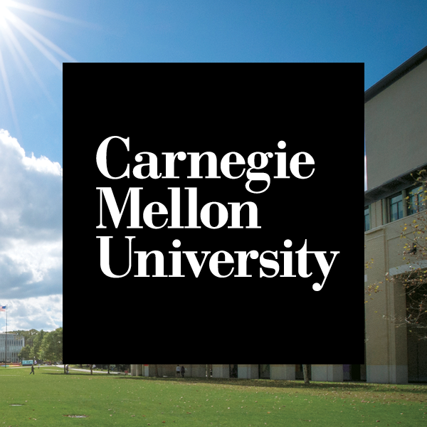
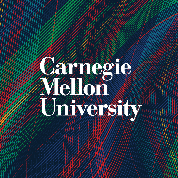
Wordmark Square
Role: This version of the Wordmark should be used whenever the brand should stand out in a punctuated manner. The square format allows for a variety of placements in both vertical and horizontal layouts by its symmetrical format. It creates a solid visual that attracts the eye and breaks from the visual clutter.
Use this mark to draw attention to the university name and over textures and photos. Always scale entire mark proportionately as a group — do not modify the elements of the Wordmark Square separately.
Digital media occasionally requires variations to the minimum size and safe zones. If faced with these challenges, email University Communications & Marketing at marketing-info@andrew.cmu.edu for custom solutions or approval.
Minimum Size
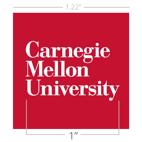
Retain all size restrictions associated with the university Wordmark. Never print the stacked Wordmark less than 1 inch or 150 pixels wide. The Wordmark to square ratio is 1 : 1.22 inches.
Safe Zone
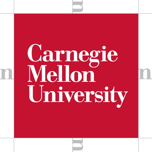
Leave at least 1 n-width buffer around the square.
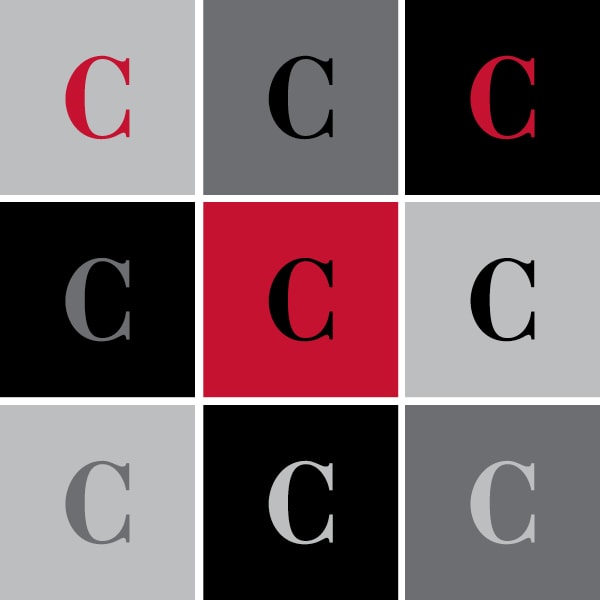
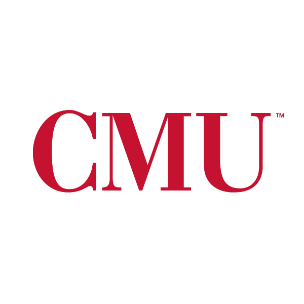
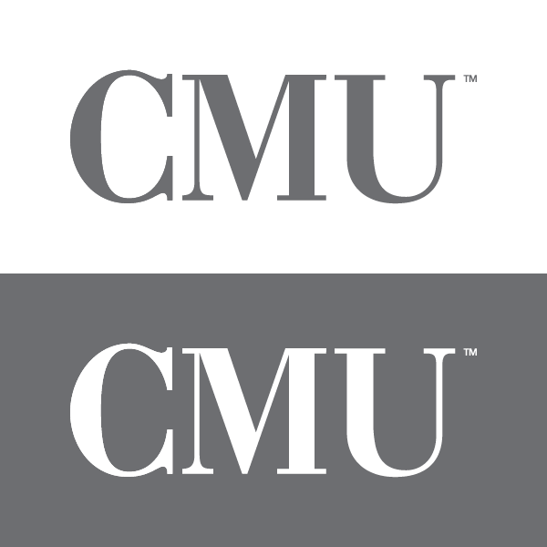
Lettermark
Role: This mark presents a more informal reference reserved for a close feeling of connection to the university. Student and alumni groups gravitate to the casual reference like a nickname to a close friend and a sense of pride.
The CMU Lettermark is a trademarked symbol of Carnegie Mellon University and therefore should never be modified or used in violation of the standards noted in these guidelines. The Lettermark must always be accompanied by visual or verbal reference to Carnegie Mellon University (e.g. - school colors, mascot, full name of institution) in some other location on the communications vehicle or product. The Lettermark should never lock up to or sit adjacent to another official university mark or any other school, college, unit name, icon or graphic.
Digital media occasionally requires variations to the minimum size and safe zones. If faced with these challenges, email University Communications & Marketing at marketing-info@andrew.cmu.edu for custom solutions or approval.
Lettermark
Minimum Size
Never print the stacked wordmark less than 1 inch or 150 pixels wide.
Safe Zone
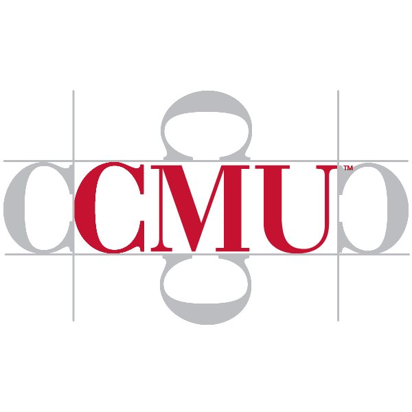
Leave at least 1 C-width buffer around the Lettermark.
Unitmarks
Role: The university’s brand architecture builds equity in all the campuses, schools/colleges, departments, divisions and centers/institutes. The name Carnegie Mellon University is our strongest unifying brand element. By using a Unitmark, which is a lock up of the Wordmark and unit name, we reinforce the brand everywhere it appears. Above all, we want to demonstrate a unified Carnegie Mellon University worldwide.
Any public or official materials associated with CMU campuses, schools/colleges, departments, divisions or centers/institutes — whether in print, online or around campus — must include the proper Carnegie Mellon University Unitmark.
By using the Unitmark, the Carnegie Mellon University Wordmark always appears above and “locked to” the unit name. NEVER crop or modify a Unitmark. Never lock-up another mark, icon, graphic or text to a Unitmark.
Unitmarks are available in the core colors and should retain color restrictions associated with the university's Wordmark.
Do not create your own Unitmark. Email University Communications & Marketing at marketing-info@andrew.cmu.edu. Your official Unitmark will be provided to you free of cost.
If you are interested in producing a branded item for unofficial use like spirit items (e.g., event t-shirt, poster), read more under Merchandise.
Campus/Location
Wordmark and Campus/Location are equal in font style, size and weight.
Schools and Colleges
Wordmark is bolder but smaller; the School is dominant in size.
Centers, Institutes, Department and Administrative Units
Wordmark and unit are balanced.
Unitmarks are available in the core colors: Black, Iron Gray and White, as well as Carnegie Red and Black (Carnegie Mellon University in Carnegie Red and your Unitmark in Black). Retain color restrictions associated with the university's Wordmark.