
CMU’s New Brand Blueprint To Unify, Inspire and Empower
By Bruce Gerson
Be compelling, be disruptive, and go big.
Those words of advice are part of a new brand blueprint designed to help the Carnegie Mellon University community tell the CMU story in a powerful and unified way.
The brand blueprint equips CMU communicators with common language and a set of refreshed visual identity elements and guidelines that help define the university’s distinctive characteristics.
Lara Steiner, senior director of marketing for the Marketing & Communications Division, said the blueprint was created after research revealed a lack of public understanding of what makes CMU a top global university.
“People knew of CMU — awareness was high — but they didn’t know what made it unique,” she said. “This blueprint gives us distinctive messaging that we didn’t have before.”
Foundation and Five Pillars of Strength
The brand blueprint is built on the strategic foundation that Carnegie Mellon is at the leading edge of human progress, which provides inspiration and sets the groundwork for all communications.
Building upon that foundation are five message pillars reflecting CMU’s distinctive strengths. They are academic excellence; real, practical impact; crossing intellectual boundaries; partnerships in action; and unorthodox culture.
“If we focus on these pillars as we develop our communications, storytelling for CMU will become stronger and more unified, and that helps to build the brand globally,” said Steiner, who credited a university-wide working group for their input in helping to create the blueprint.
CMU communicators are encouraged to use supporting information, or proof points, such as past achievements and current examples related to their college, school, department or unit, to build on the pillars.
Hero, Sage and Outlaw
A key part of any brand is personality.
“Personalities allow you to think about your brand as being human,” said Brian James, senior director of creative for Marketing & Communications. “By associating a brand with human character traits, it is easier to imagine how we might speak about them or how they should be portrayed.”
James said the personality of CMU aligns to three different types of characters that we find in storytelling: the hero, the sage and the outlaw.
“A hero is going to be bold, see a need and fill that need. A sage is always looking for wisdom, to learn new things and to share that knowledge. The outlaw looks to bend the rules, challenge conventional thinking and create something new. I am sure we all know more than a few heroes, sages and outlaws at CMU,” he said.
The blueprint challenges communicators to draw their readers into the story, bend the conventional rules and break the mold.
“Go big! Be confident of who we are and what we’re doing,” James said.
Visually Speaking
 Among the visual elements getting a refresh are the wordmark, university seal and mascot mark, and new to the university’s identity set is the CMU lettermark.
A new format for the most universal mark, the wordmark, places the stacked Carnegie Mellon University in a black, red, white or grey square. This “wordmark square” creates a strong visual that stands out from any textured or photographic background and should be used to draw attention as seen in the new signage system being installed on the Pittsburgh campus.
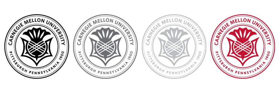
The university seal is the most academic symbol and is now available to all units and departments in a one-color format — black, gray, white and red. The full-color seal is reserved for official use and special events, like commencement and convocation. At the center of the seal is the thistle, Scotland’s national flower, which represents, strength, bravery, determination, devotion and durability.
The mascot mark — Scotty in a shield with Tartans spelled out across the top — represents the university’s competitive spirit. While mostly used in the past for athletics, the mascot mark is intended to be used by anyone wanting to show their school pride.
“The Scottish Terrier is a very confident breed and a consistent winner at international competitions,” James said. “It’s a spirited breed and known to be aggressive around larger dogs. We should embrace this confidence as we present CMU to the world.” 
Our university initials, CMU, now have an official mark of their own, known as the lettermark. Similar to a nickname, this mark adds a visually friendly option for branding. Always use the lettermark in proximity to the full wordmark for clarity of the official school name.
Broadening the Color Palette
New secondary color palettes are being introduced to provide a wider range of tones that represent CMU’s various personality traits. These palettes are derived from the bold colors of the Tartan and the soft colors of the campus architecture. The new color palette includes matching paint swatches, which can be used by CMU’s interior designers to incorporate the brand into every area of the campus.
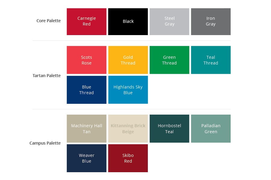
CMU’s core colors remain red, black, steel gray and iron gray.
Complementing the color palettes is the traditional tartan, the plaid pattern that was first introduced by a student group in 1905-06 and “has become a statement of our diverse community weaving together to become something greater,” James said.
For more information visit www.cmu.edu/brand and download an “essentials toolkit,” including the gallery of visual elements and communications guidelines.