Bernie
Hogan, “Pinwheel Layout to Highlight
Community Structure”
Research Fellow, Oxford Internet Institute
Pinwheel Layout to
Highlight Community Structure

Caption
The
intuitive appeal of force-directed layouts is due in part to their ability to
represent underlying community structures. Such diagrams show dense pockets of
nodes with bridges connecting across clusters. Yet, it is possible to start,
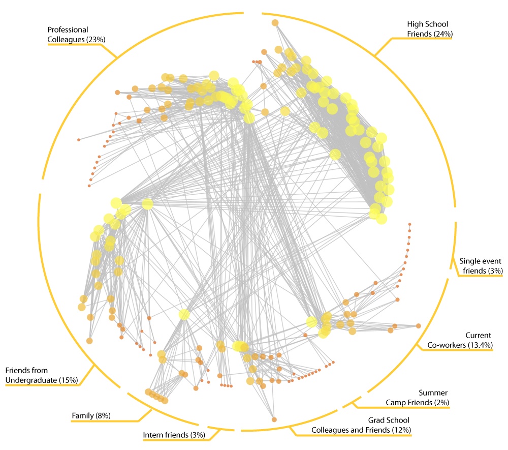
rather than end, with community structure. This is a “pinwheel” diagram using
the author’s Facebook personal network (captured July 15, 2009). Nodes
represent the author’s friends and links represent friendships among them. The
author is not shown. Each ‘wing’ radiating outwards is a partition using a
greedy community detection algorithm (Wakita and Tsurumi, 2007). Wings are
manually labelled. Node ordering within each wing is based on degree. Node
color and size is also based on degree. Nodes position is based on a polar
coordinate system: each node is on an equal angle of n/360º with a radius being
a log-scaled measure of betweenness. Higher values are closer to the center
indicating a sort of cross-partition ‘gravity’.
This
layout has several notable features:
- The angle of each wing is
proportionate to its share of the network. Thus 25 percent of nodes go from 0 to 90º.
- Partitions are distinguished
by their position rather than a node’s color or shape.
- The tail indicates the
periphery of each partition. A wing with many tail nodes indicates many people who are only
tied to other group members.
- Edges crossing the center show
between-partition connections. Since nodes are sorted by degree it is easy to see if edges originate from the
most highly connected nodes or the
entire partition.
This visualization is oriented
towards well-connected modular networks (meaning they are easily partitioned
into distinct communities). Facebook egocentered networks often have these
properties, whereby each partition represents a life course stage or social
context and close friends link between partitions.
In this network it is easy to
see a strong series of linkages between high school and university as well as
high school and family. There are many ties between the current co-workers and
professional colleagues, and neither connects substantially to high school.
While just as populous, the professional partition is far less dense than the
high school partition.
Self-Commentary
The data was captured using a
custom-built publicly available Facebook application. This application employs
the Facebook API to query for a user’s friends and the connections between
these friends. The clustering and layout was done using NodeXL, a network
analysis add-on for Excel 2007.
To create this diagram, I
“hacked” many of the features of NodeXL. For example, to layout nodes within
each partition according to degree I had to first convert the cluster names to
cluster numbers. Since degree has a maximal value of n-1, I multiplied each
node’s cluster number by n and then added degree thereby ensuring no overlaps.
The polar coordinate system does not pay attention to the layout order, so I
first laid the nodes out using a circle layout and converted the X and Y
coordinates to Radians. The betweenness values only span half of the radius
rather than the full radius because otherwise links between adjacent
communities would look messy.
The viewer may notice that I
used degree for three metrics: within-partition ordering, size and color. The
combination of all three gives the nodes its wing-like shape and gradient.
Regardless of the metric used for within-cluster ordering, I recommend also
using it for color and shape as well.
NodeXL is very flexible but it still has many limitations. For example, it currently only includes one community detection algorithm (although it is simple enough to paste in other partitions done through other packages). This particular algorithm misclassified a handful of nodes leading to unnecessary edge-crossings.
PEER REVIEW COMMENT
No. 1
In this representation of Facebook, partitions are denoted
by position rather than color – which is a clever way to layer more information
into the figure. The groups breakdown along foci, or social contexts -high school,
camp, college, work etc, and the pinwheel figure nicely illustrates the
different foci in ego's network.
However, one wishes the highly interconnected foci were positioned
closer
together along the wheel in some way that would minimize the edge-crossing in
the middle. I wonder if the duplication
of degree in size, color and position is necessary, or if one could usefully
integrate other information through color (say ratio of ties within and between
foci), to increase the information content of the image.
PEER REVIEW COMMENT
No. 2
The pinwheel layout highlights the organizationally focused nature of friendship ties in the author’s ego network. The diagram captures the relationships that span organizational settings, and more importantly, it does a very good job of showing how densely (or sparsely) the settings are connected with each other. This effect is aided by having the set of ties related to each setting be sized proportional to its contribution to the ego network. The visualization may be improved by imposing some sort of order on where the settings themselves are placed, so that they are chronological or so that settings that share more ties are next to each other.
PEER REVIEW COMMENT
No. 3
This submission successfully
rebels against the convention force-directed layout, reengineering the circular
layout in an information-rich way. The
degree ordering is effective in allowing one to get a sense of how different
partitions connect to each other, both in terms of number and distribution of
cross-ties. I'd love to see if this
layout would work semi-circle (which might permit degree ordering to be
arranged in a roughly up-down fashion while still preserving its radial
merits).