Mapping Globalization: Visualizing the Network of Global Trade
Manish NagDoctoral Candidate at
Mapping
Globalization: Visualizing the Network of Global Trade
Caption
How global is globalization? The last 20 years have witnessed an explosion
of international connections and transactions: we travel more to each other’s
cities, buy more of each others’ products, and are more likely to read each
others’ newspapers and best-sellers. But
there are severe limits on the reach and degree of globalization. European and North American newspapers are
more likely to be read by an international audience than their Indian or
Brazilian counterparts. Style and
sophistication are still more associated with
Even in
the most globalized of arenas, the pattern of relations and connections can
still look remarkably like the 19th century. Despite the prophesied rise of a “Pacific
Century”, most of the global action remains rooted in the
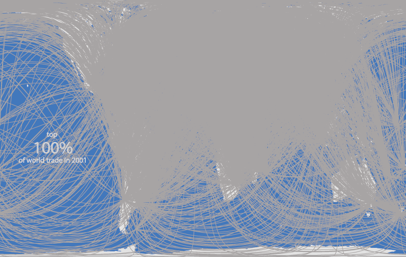
Our
animation documents this by tracking global trade in 2001. Counting all possible dyadic transactions we
have taken graphic photographs of four levels of trade. The first image of all
global trade includes the numerous, but often insignificant, links connecting
the globe. In the next image of the top
75% of trade, the number of countries involved and lines linking these are noticeably
reduced (and the overall geographical concentration and centrality of the
Self-Commentary
Our
visualization was created using
For our
example, since nations were our actors, we positioned each graph vertex on the
nation's capital city. The latitude and longitude data was obtained from the
CIA World Factbook. Once, the data files were uploaded, the
The
matrix data was furnished by the Mapping Globalization website at
Once
images were created in
Though we created visualizations for other percentages of world trade, we found that choosing the top 25, 50, 75, 100 percentages of world trade summarized the larger point of how much the network of nations shrank as we visualized smaller slices of world trade.
PEER REVIEW COMMENT
No. 1
This is a creative animation; when all of the global trade is included it does appear as if global trade is truly global, as the map is literally filled with connections. But the story is quite different, when one only considers the top 75%, 50% or 25% of the global trade: here the marginal countries drop out of the network and only the major industrialized nations remain. This large scale visualization tells a clear story in a creative manner, but the figure could perhaps be improved by adding a bit of color to liven the picture or layer more information (such as content of trade, say). It might also be useful to make the edges more transparent, so that the map shows through even when full.
PEER REVIEW COMMENT
No. 2
This visualization uses an interactive layout to show how regions of the world are integrated through trade. At the most integrated level when 100% of global trade is depicted, the entire world appears integrated. When that level is dropped to 75% of global trade, the picture is very different. The wealthiest nations, and within them – regions, remain. This visualization is very effective already, but perhaps a heat color pattern on the underlying picture or variable line thickness would be a nice addition, to help contextualize each ‘slice.’ The dynamic elements are rhetorically effective – the inequality jumps out in the contrast between the slices – but I wonder how effective it would be to shade ties by proportion of world trade and then layer the information as a single figure?
PEER REVIEW COMMENT
No. 3
This
map does making a striking clear visual case for the inequality among national
actors involved in the global economy.
Its use of edge thresholds leads us naturally to the author’s conclusion
without needing to convince us with captions and supplementary material. I would love to see the edges draw with edge
opacity proportional to the trade volume represented by the tie (this might
yield a single image that displays all ties, but still permits those few,
elite, high-volume ties to stand out).