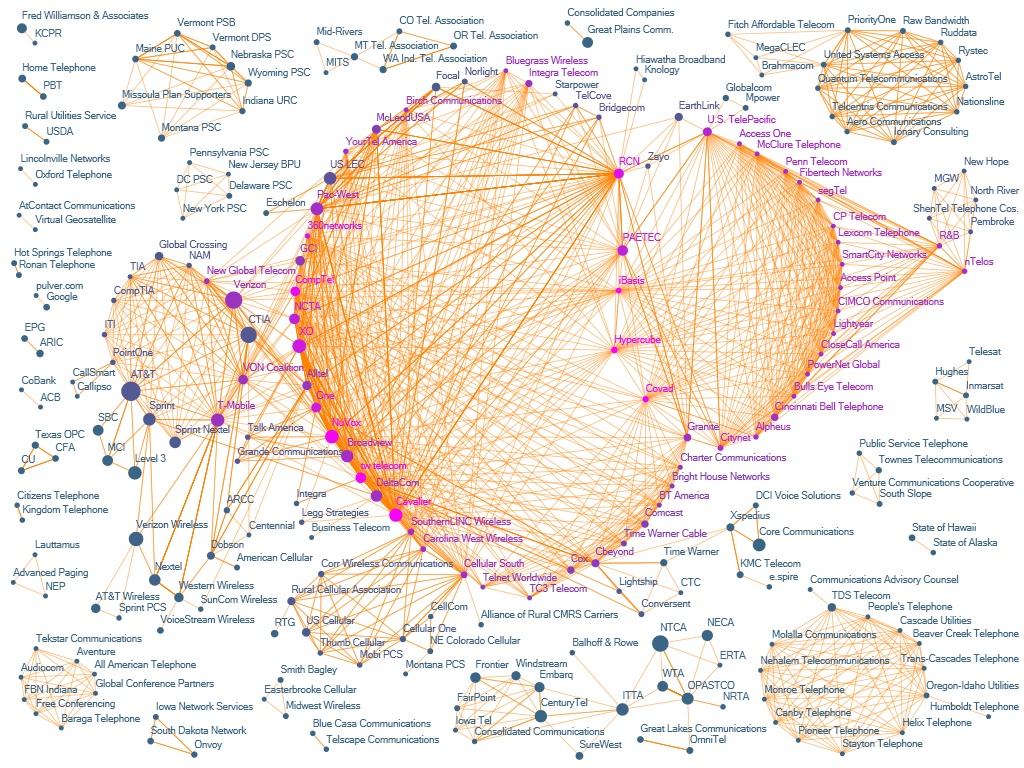
The Evolution of FCC Lobbying Coalitions
Pierre de VriesResearch Fellow at the Economic
The Evolution of FCC Lobbying Coalitions
Self-Commentary
The graph is derived from
meta-data associated with documents that are filed electronically whenever an
organization interacts with the FCC, in accordance with the Administrative
Procedures Act. Whenever a letter, comment or other document is filed, the
filer provides information on the parties involved, number of pages, relevant
proceedings, date, etc.
When this project started, the
meta-data was not readily available. While it was public in the form of search
results generated by the FCC’s Electronic Comment Filing System (ECFS), screen
scraping a decade of data ten records at a time proved to be impractical.
Fortunately Bill Cline, manager of the
Once the raw data had been
obtained, it had to be cleaned. The metadata is typed into ECFS by paralegals
when documents are filed – often in a rush just before a filing deadline – and
input errors are common. They include misspellings and multiple variants of
organization names, information entered into the wrong fields, and mismatches
between information in the filing and the metadata. There are also ambiguities
that are not strictly speaking errors, such as inconsistencies in specifying a
subsidiary vs. a holding company, “doing business as” designations, fields left
blank in some filings but not others, and abbreviating the list of filing
entities. Before generating graphs, a clean-up macro (programmed in Visual
Basic for Applications) was run against a synonym list currently contains more
than 4,000 entries.
This project focused on the
connection implied by organizations filing together. While multiple filers
names are sometimes given in metadata, at other times merely one company name
plus “et al.” is given. For such records one has to refer to the underlying
filing to “unpack” the list of all the other filers. This work cannot be easily
automated, and was done by hand in this case; since it is so time-consuming, it
was one of the reasons for limiting attention to a single proceeding that
spanned only seven years.
Once the data is cleaned up, an
edge list is created in Excel by running another VBA macro. A graph is created
from this list with NodeXL, a social network analysis and visualization add-in
for Excel 2007. NodeXL’s Fruchterman-Reingold algorithm is used to prepare a
preliminary layout; nodes are then moved by hand into visually intelligible
positions, respecting the clusters suggested by NodeXL’s implementation of the
Wakita-Tsurumi algorithm. Nodes are colored on the basis of eigenvector
centrality. The degree of investment that organizations make in lobbying is
measured by the total number of filings it made in this proceeding over the
period of study, and reflected in the size of the node. This information is
obtained by running another VBA macro against the underlying ECFS metadata, and
then matching that to the vertices in the graph.
Some ambiguities in the data remain to be resolved. Assume that one chooses to map holding companies rather than subsidiaries (rather than vice versa), and has succeeded in substituting subsidiaries named in filings by their parents; on-going mergers and acquisitions changes this mapping over the period being analyzed. Acquisitions lead to companies absorbing not only competitors (that may have been in disjunct clusters early in period of study), but also changing their business interests. In this data set, for example, the “old” AT&T was a long-distance carrier at odds with regional telephone companies like SBC; after the merger in 2005, the “new” AT&T came to have the interests of SBC.
PEER REVIEW COMMENT
No. 1
This visualization captures the formal connections between lobbying organizations in the fight over telephone transfer fees. This representation suggests that the companies lobbying the most, or the most well connected, are not necessarily the most structurally important, or the most influential. Smaller companies can play important lobbying roles if they connect particular lobbying subgroups to each other. This visualization offers a clean picture of the lobbying network but provides little information about the companies: perhaps a different color scheme, combinations of shapes, or more exaggerated node sizes could have told a clearer story about the kinds of companies playing different roles.
PEER REVIEW COMMENT
No. 2
This visualization clearly depicts the connections made between phone company’s lobby groups, and the extent of pairwise connectivity is captured by the edge color. Since node size represents the number of filings that a company is on, it appears clear that the number of filings alone do not determine the centrality (which is indicated by “pinkness”). The color scheme may not be optimal, however, as it is difficult to ascertain the importance of edge weight or co-filings without very careful study, since the different shades of orange are difficult to discern. The placement of the isolated components in the margins appears to be arbitrary, but it might make sense to imbue the macro-space with meaning here as well.
PEER REVIEW COMMENT
No. 3
This
layout does a good job of making coalitions easily apparent to the viewer. I'm curious whether there is a size
effect. If node size was proportional to
either volume of telecom traffic or total corporate worth, would we see
peer-preferences in coalition choices?