JoSS Article: Volume 11
Bi-Annual Ratings of State Higher Education Systems 2000-2006
Fabio Guillermo Rojasa and Amia Fostonb,a
Assistant Professor at
b Graduate Student at
A
Graph that Visualizes Social Science Sequence Data
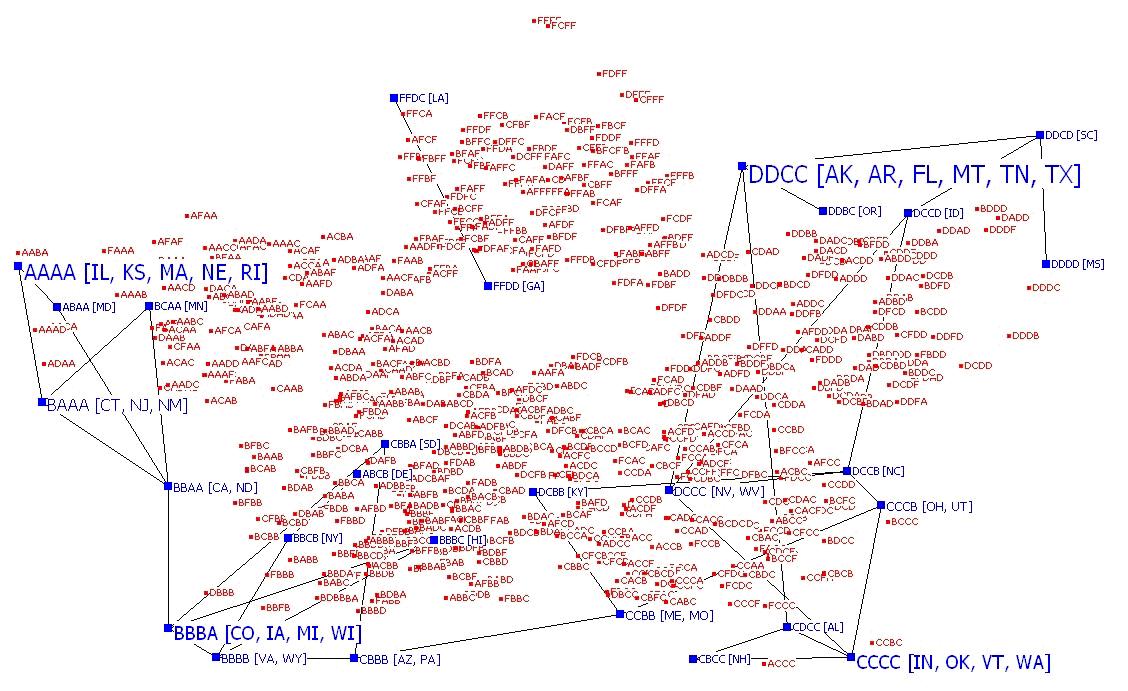
Self-Commentary
Two sequences (e.g., aabcb and
abcaa) may be compared using a distance measure. The optimal matching algorithm
computes the total number of substitutions and insertions (or deletions)
required to transform one sequence to another (Abbott and Hrycak 1990). The
optimal matching algorithm may be used to compute the adjacency matrix of any
collection of sequences. In this diagram, two sequences are adjacent if their
optimal matching distance is equal to one. Other distances may be used in
different applications. Therefore, one may visualize the entire space of
sequences of length T that employ N symbols using a graph based on the optimal
matching algorithm. In creating a two dimensional representation of the graph,
sequences that use only the Kth symbol are placed at the coordinates (sin
(K2π/N), cos(K2π/N)). Thus, the “pure” sequences (e.g., aaaaa) are at
the corners of a “star” with N corners. Other sequences are placed according to
their most common symbol (e.g., a is the most common symbol of aaabb). If f is the
frequency of the most common symbol in a sequence, the coordinates are f/T x
(sin (K2π/N), cos(K2π/N)). The coordinates are randomly perturbed to
prevent excessive node overlap. Informally, the homogeneous (“pure”) sequences
are placed at the end points of a star with N points, others are placed on the
interior, but close to the “pure” sequence with whom they share the most common
symbol (e.g., aaabb and aaaaa are close to each other).
Graph visualization may guide
analysis of observed sequences. Contrasting the sub-graph of observed sequences
and the graph of all possible sequences can provide additional insight into the
types of trajectories that may occur within the sample. We illustrate this idea
with data from the
References
Abbott,
Andrew and Alexandra Hrycak. 1990. "Measuring Resemblance in Sequence
Data: An
Optimal
Matching Analysis of Musicians' Careers." American Journal of Sociology
96:144-185.
PEER REVIEW COMMENT No.
1
This visualization explores the distribution of State Higher Education grades by comparing all possible grading sequences to the observed sequences. The contrast between the constructed sequences in red and the observed sequences in blue illustrate the restricted range in which grades are actually given out. Moreover, the observed sequences show strong regional clustering in grades ( perhaps mapping onto geographical variation on educational funding or institutional strength?). This sequence graph clearly shows the state space for the outcomes of interest; it isn’t as “clean” as one might like, since many of the sequences run over each other (and the resolution seems low), making it somewhat difficult to read.
PEER REVIEW COMMENT No.
2
This visualization lays out the full range of possible combinations of grades on a state report card of key performance indicators and shows that of the many possible sequences, the empirical distribution tends to be very concentrated. The use of color contrast nicely highlights the state trajectories that have been mapped in blue against a backdrop of the red solution space with the A/B trajectories predominately representing Northern states and the C/D trajectories predominately representing Southern States. Although the non-random nature of the empirical distribution is clearly represented by this visualization, it is hard to find an overall pattern, and one wonders if there might be a way to somehow sharpen this display to layer more information?
PEER REVIEW COMMENT
No. 3
This network diagram makes great use transforming
distance. It also arrays the actual data
in a permutation space, giving us a great sense of how this data falls within
the space of all possibilities. I
wonder how this visual might look if the y-axis was sensitive to trajectory –
what would it tell us we could distinguish states with consistently improving
grades from those without?