
Figure 1. Image of a Pattern of Linkages (Moreno, 1932, p. 101)
Figure 2. Moreno's Image of Who Recognized Whom Among a Collection of Babies (Moreno, 1934, p. 32).
Visualizing Social Networks
Linton C. Freeman
The paper reviews the long history of image use in the field. It begins with illustrations of the earliest hand-drawn images in which points were placed by using ad hoc rules. It examines the development of systematic procedures for locating points. It goes on to discuss how computers have been used to actually produce drawings of networks, both for printing and for display on computer screens. Finally, it illustrates some of the newest procedures for producing web-based pictures that allow viewers to interact with the network data and to explore their structural properties.
ABSTRACT:
This paper documents the use of pictorial images in social network analysis. It shows that such images are critical both in helping investigators to understand network data and to communicate that understanding to others.
1. Introduction: Imagery in Social Network Analysis
The use of visual images is common in many branches of science. And reviewers often suggest that such images are important for progress in the various fields (Koestler, 1964; Arnheim, 1970; Taylor, 1971; Tukey, 1972; Klovdahl, 1981; Tufte, 1983; Beliën and Leenders). The historian Alfred Crosby (1997) has gone much further. He has proposed that visualization is one of only two factors that are responsible for the explosive development of all of modern science. The other is measurement.
These two factors seem to have been central in the growth of social network analysis. Advances in measurement have been both rapid and regular in social network research (Wasserman and Faust, 1994). And, from the beginning, visual images have played a key role in the field (Wolfe, 1978; Hage and Harary, 1983). Images of social networks have provided investigators with new insights about network structures and have helped them to communicate those insights to others (Freeman).
Two distinct forms of display have been used to construct images of networks, one based on points and lines and the other on matrices. In most point and line displays the points represent social actors and the lines represent connections among the actors. In matrix displays the rows and columns both represent social actors and numbers or symbols in the cells show the social connections linking those actors. The overwhelming majority of network images have involved the use of points and lines. In the present paper, therefore, I will focus on the development of those point and line imagess.
There have been five fairly distinct phases in the development and use of point and line displays in social network analysis. First, beginning in the 1930s, graphic images were produced by hand. They were ad hoc and their success varied with the insight and artistic skill of their creator. Second, in the early 1950s, investigators began to turn to the use of standard computational procedures to produce images. Third, in the 1970s, computers became widely available and began to be used to produce machine drawn images automatically. Fourth, in the 1980s, the presence of personal computers encouraged investigators to develop images that could be displayed on monitors and in color. And fifth and finally, in the 1990s, the availability of browsers and the World Wide Web opened up all sorts of new possibilities for graphic display. I will review this history and the present state of the art in this paper.
2. Hand Drawn Images in Social Network Analysis
Network analysts study the patterning of the social connections that link sets of actors. For the most part they seek to uncover either or both of two kinds of patterns. They often look for social groups -- collections of actors who are closely linked to one another. Or, alternatively, they look for social positions -- sets of actors who are linked into the total social system in similar ways.
From the beginning, network images have been used to call attention to one or both of these two kinds of structural patterning. Some images are constructed in such a way that they emphasize important features of group structure. Other images stress similarities and differences in the positions occupied by actors. And some images manage to reveal a good deal about both groups and positions at the same time.
The use of visual images to display these kinds of social patterns stems, in large part, from the fact that images were central features of the foundational work of Jacob L. Moreno (1932, 1934). In discussing his approach, Moreno (1953, pp. 95-96) stressed his reliance on the use of pictorial representations to map social linkage patterns:
We have first to visualize . . . A process of charting has been devised by the sociometrists, the sociogram, which is more than merely a method of presentation. It is first of all a method of exploration. It makes possible the exploration of sociometric facts. The proper placement of every individual and of all interrelations of individuals can be shown on a sociogram. It is at present the only available scheme which makes structural analysis of a community possible.
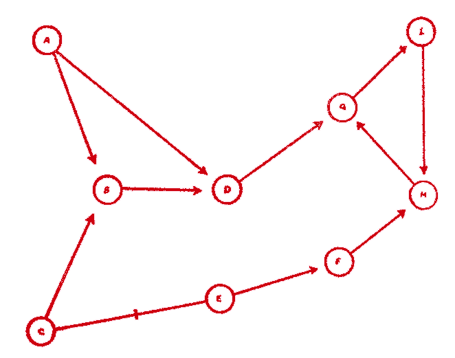
Moreno began by defining a collection of actors and some relation that might or might not link any particular pair of those actors. He then collected data on who was linked to whom and used those data to construct a picture that displayed the patterning of linkages. In his earliest images Moreno used points to represent actors. And when the relation linked any pair of actors, he drew a line connecting the points representing the two. This kind of drawing is shown in Figure 1.
|
|
|
|
Figure 1. Image of a Pattern of Linkages (Moreno, 1932, p. 101) |
Figure 2. Moreno's Image of Who Recognized Whom Among a Collection of Babies (Moreno, 1934, p. 32). |
Technically, the object shown in Figure 1 is a graph. A graph consists of a set of points along with a set of lines connecting pairs of points. Moreno was, so far as I can discover, the first to propose using that kind of image to reveal important structural information about social linkage patterns. In the drawing of Figure 1, he suggested that the individuals at the top and the bottom were "dominant" and that they were linked both "directly" and "indirectly."
Very soon Moreno (1934) generalized this approach. He suggested that there might be a directed relation linking two actors A and B. Suppose, for example, that A reports responding to B while B does not respond to A. In such cases Moreno suggested drawing a directed line -- one with an arrowhead -- from the point representing A to the one representing B. Then if each responded to the other (see C and E in Figure 2), he proposed drawing a line without arrowheads (but with a small crossing line splitting the line connecting the pair).
This kind of drawing is called a directed graph. It reveals important structural features of the data. Baby A for example was seemingly at the bottom of some sort of hierarchy of recognition; it was not recognized by any of the others. In contrast, B, D, G and H were at the top; each was recognized by two others. And C, E, F and I were in the middle; each was recognized by one other. But the hierarchy is far from strict; C and E recognized each other, and G, H and I formed a cycle in which G recognized I, I recognized H and H recognized G.
It should also be noted that there are no crossing lines either in Figure 1 or Figure 2. Later, Moreno (1953, p.141) specified this idea as a general rule for constructing sociograms. He said, "The fewer the number of lines crossing, the better the sociogram." This rule is still widely used.
Moreno did not limit his drawings to these simple forms. He used variations in both the locations and the shapes of points to convey additional information about the structural properties of social networks. Consider, for example, the image shown in Figure 3. The data are friendship choices made by fourth grade children. Boys are shown as triangles and girls as circles. All the boys, moreover, are drawn on the left of the image and all the girls are on the right. The different shapes and the placement of points show dramatically the segregation of choices by gender. In fact, only one boy chose a girl and no girl chose any boy as a friend.
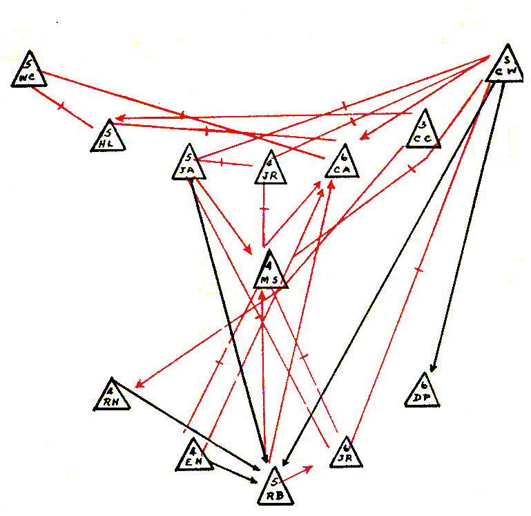
Moreno often collected data both on who liked whom and who disliked whom. He combined both liking and disliking in a single multigraph in which he used color to show both relations in the same picture. Figure 4, for example, shows his image of positive and negative choices in thirteen members of a football team, including two substitute backs. There, the points are located more or less in the positions the individual players occupy on the field. The red lines depict positive choices and the black lines are negative choices. Moreno noted that 5RB, the fullback, received no positive choices and was the target of four negative ones. As he put it (1934, p. 213), "when (he) is running with the ball he is not apt to get the maximum of cooperation in interference and blocking."
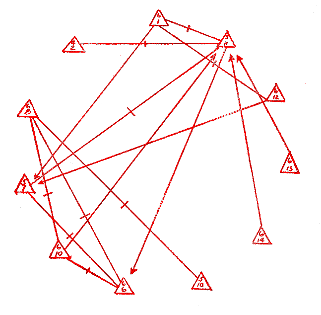
Moreno used all sorts of arrangements of points in order to stress particular important features of inter-actor links. But, when he had no specific basis for arranging points in one particular form or another, he simply arranged them into a circle. Figure 5 shows his image of positive links among the members of a school fraternity. In that picture, actor 5/11, the president of the fraternity, is the point chosen most often.

|
|
|
|
Figure 3. Friendship Choices Among Fourth Graders (from Moreno, 1934, p. 38). |
Figure 4. Positive and Negative Choices in a Football Team (Moreno, 1934, p. 213). |
Figure 5. Positive Choices in a School Fraternity (Moreno, 1934, p.51). |
Thus, in his early works, Moreno introduced five important ideas about the proper construction of images of social networks: (1) he drew graphs, (2) he drew directed graphs, (3) he used colors to draw multigraphs, (4) he varied the shapes of points to communicate characteristics of social actors, and (5) he showed that variations in the locations of points could be used to stress important structural features of the data.
Except for his use of color, other investigators were quick to follow Moreno's lead. The expense involved in using colored ink in printing led publishers to refuse to accept colored images. Nevertheless, black and white pictures of both graphs and directed graphs began to appear everywhere.
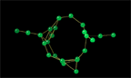
Many early images adopted Moreno's practice of arranging points into a circle. In fact, structural analysts keep returning to the circle as a way of arranging their points (Loomis, Morales, Clifford and Leonard, 1953; Lesniak, Yates, Goldhaber and Richards, 1977; Krackardt, Blythe and McGrath; Mitchell, 1994; Kirke, 1996).
A good many investigators have followed up on Moreno's practice of using variations in the shapes of points to call attention to differences in actors' characteristics. In Figure 12 (shown below), for example, Northway (1940) reported the use of line drawings of children's faces to distinguish boys from girls. And in Figure 14, Bock and Husain (1952) used the standard symbols for male and female to make the same distinction.
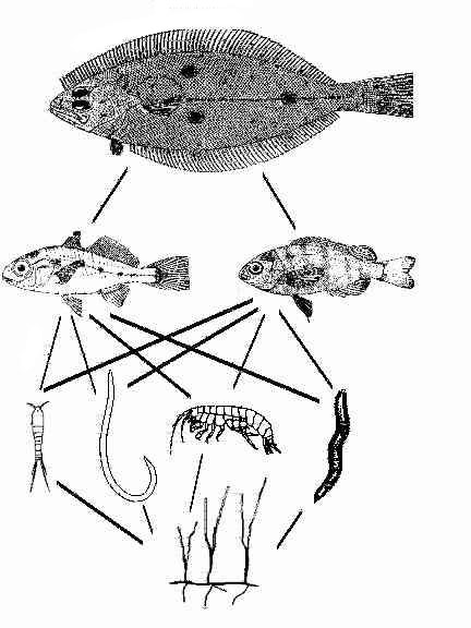
To this day, investigators continue to innovate by producing new ways to use variation in the shapes of points to communicate important structural features of their data. An elaborate display was employed in a recent picture produced by Baird, D. J. Luczkovich, and R. R. Christian. (1998). They studied the food web in the St. Marks National Wildlife Refuge, Apalachee Bay, Florida and constructed an image of who eats whom in that community. Their picture is shown in Figure 6. They described the structural pattern in these words:
The producer base of this sub-web shows shoal grass (Halodule wrightii); primary consumers shown are various species of herbivores and detritivores including meiofauna (represented here by a harpacticoid copepod and a nematode), amphipods, and polychaetes; secondary consumers shown are juvenile spot (Leiostomus xanthurus) and pinfish (Lagodon rhomboides); tertiary consumer shown is the gulf flounder (Paralichthys albigutta).
Although a good many investigators innovated in introducing new point shapes, a far more common concern has been with the question of how to locate the points on the page. Moreno's idea (shown in Figure 4) of placing points in positions that map to their actual locations in physical space has been widely used, particularly by rural sociologists and by geographers.
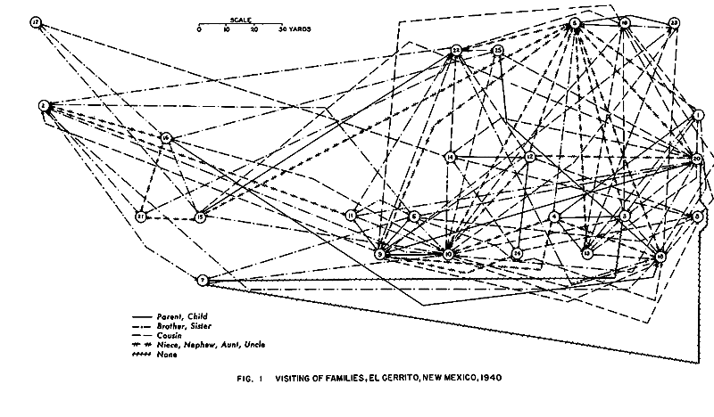
In their study El Cerrito in rural New Mexico, for example, the sociologists Leonard and Loomis (1941) drew an image of various kinds of visiting patterns as an overlay on a map of physical sites occupied by families. It is shown in Figure 7.
|
|

|
|
|
Figure 6. A Nautical Food Web. |
Figure 7. Visiting Patterns among Households. |
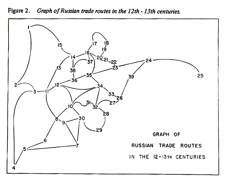
Figure 8A. A Map of Russian River Trade Routes. |
Figure 8B. A Graph of Russian River Trade Routes. |
Festinger, Schachter and Back (1950) did the same thing when they overlayed network connections over a map of residence locations. But the geographer, Pitts (1979), converted an actual map of twelfth and thirteenth century Russian river-based trade routes among hamlets into a social network. His map and his network are both shown in Figure 8. In an analysis of the data embodied in this figure Pitts discovered that among all these hamlets, the one with the highest centrality was the one named Moscow.
Quite early in this process, investigators began to introduce innovations designed to extend Moreno's general approach in ways that would emphasize structural features of special interest to them. One structural feature that was of great interest to early investigators was the sociometric status of each point. The sociometric status of a point was defined as the number of choices, or the strength of the choices, received by that point. Investigators thought that this might be a good index of power or influence.
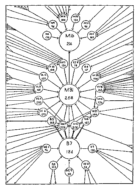
Lundberg and Steele (1938), for example, specified the nuclei of a network as those actors with high sociometric status. They constructed their famous "lady bountiful" image by making the nuclei larger than other points and by placing them near the middle of their drawing. Then they arranged the points representing actors who were chosen less often in circles around the nuclei. See Figure 9 where the number associated with a point is based on an index of the social class of the actor represented by that point.
|
|

|
|
Figure 9. The "Lady Bountiful." |
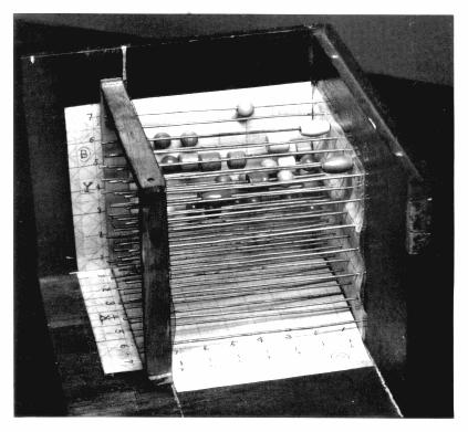
Figure 10. Apparatus for the Display of the Data of Figure 9. |
Figure 11. A Target Sociogram. |
An interesting footnote to this figure is that Lundberg's father-in-law, Chapin (1950), developed a very early three-dimensional display of social network data. He began with the data from the lady bountiful diagram and built an apparatus that showed the social status, the outdegree and the indegree of every point. In Figure 10 the vertical dimension is social status, the horizontal one is outdegree and the one running in and out is indegree. Chapin argued that the center points of Figure 9 are really isolates and should be displayed as such.
In any case, later investigators picked up on Lundberg and Steele's idea of varying the sizes of points in order to emphasize their differences in sociometric status. Loomis (1946) used it extensively, to stress the differential statuses of the families he studied. And recent images produced by Krempel (see Figure 28 below) still vary point sizes to call attention to their sociometric statuses.
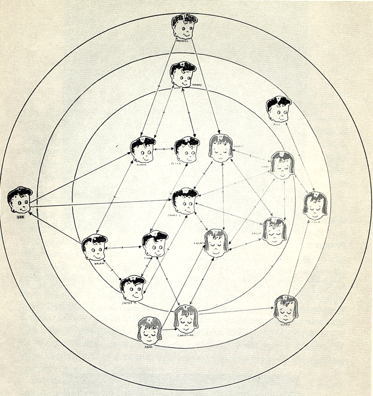
Northway (1940) was also influenced by the Lundberg-Steele approach. She generalized their idea of locating popular points in the center of network diagrams. She used that idea to develop a systematic procedure for calling attention to differing levels of sociometric status. She called her display a target sociogram. Consider a nested series of concentric circles, like the ones shown in Figure 11. Each circle contains points that are equal in terms of how frequently they were chosen. Points in the central circle are more central in the sense that they were chosen more often. Points at the edge were chosen less often. The lines connecting them represent the primary links between pairs. And all the points are placed in the rings in such a way that the lines connecting them are relatively short. Like Moreno's dictum about lines not crossing, Northway's rule that lines should be short has been widely adopted.
Grant, one of Northway's students (Northway, 1952) drew that target sociogram shown in Figure 12. In her drawing, faces are used to designate males and females. And in addition, Grant shaded her drawing in such a way as to emphasize its center and thereby to call special attention to the more popular actors. And, as was the case for point size variations recent images produced by Krempel (see Figure 28 below) still highlight the centers of images.
|
|
|
Figure 12. Grant's Drawing of a Target Sociogram of a First Grade Class (from Northway, 1952). |
Figure 13. McKenzie's Target Sociogram Board (from Northway, 1952). |
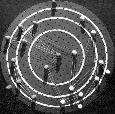
Clearly, the kind of arrangement shown in Figures 10 and 11 emphasizes the sociometric status of points. Since status was a major focus of interest in that period, Northway's procedure caught on very quickly. Its success led one of Northway's colleagues, McKenzie, to design and construct a different kind of apparatus, one designed for displaying network structure easily (Northway, 1952). She called it the target sociogram board. It is shown in Figure 13. It was built from a round piece of pegboard upon which circles were painted. Points were pegs that could be plugged in anywhere on the board. Simply attaching a rubber band to the two points could show a mutual link between a pair of points in question. Thus the board allowed for the construction of quick and simple displays emphasizing certain structural features of a data set.
Most early network drawings followed one or another of the image designs introduced by Moreno, Lundberg and Steele or Northway. But, beginning in the 1950s, some investigators began to seek ways to use standard computational procedures as part of the process of producing point and line drawings. Their efforts will be reviewed in the next section.
3. Point and Line Images Grounded in Computation
The earliest use of computational procedures in producing point and line diagrams all focused on the problem of determining locations for the points. Bock and Husain (1952) and Proctor (1953) were the first to report using computational procedures to aid in placing points. They both used factor analysis, but produced very different kinds of images.
Proctor was part of a study team of rural sociologists who examined the social structure of the Turrialba Valley of Costa Rica. The study included a questionnaire that was administered to the heads of households in two communities. One of the questions was "In case of a death in the family, whom would you notify first?" The answers to that question were examined in detail. Proctor counted the "agreements," the number of times two actors chose one another and/or both chose the same third actor). The matrix of agreements was converted into a matrix of correlations and a factor analysis was performed on that matrix.
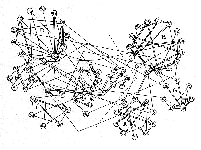
Proctor used the results of the factor analysis to partition the families into groups. Each of the first seven factors was strongly associated with a different subset of families. Each of these seven factors was used to define a "clique" of families that were linked together. Figure 14 was produced by arranging the members of each "clique" into a circle and placing the seven circles in arbitrary locations in the page.
|
|
|
Figure 14. "Cliques" of Families in Atirro, Costa Rica. |
Figure 15. Clusters of School Children (Bock and Husain, 1952). |
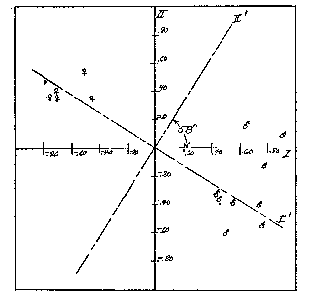
Bock and Husain (1952) also used factor analysis. They asked each of the 16 members of a ninth grade class to rank all of the others in terms of their desirability as collaborators on a joint research project. Thus they collected quantitative data on the perceived strength of the ties connecting pairs of actors.
Like Proctor, Bock and Husain began by correlating the various students' rankings and they performed a factor analysis of the correlation matrix. But they used the results of their factor analysis to construct a different kind of image. Their analysis took advantage of the fact that factor analysis maps each observed variable (in this case the 16 correlations) into a new variable, or vector. These new variables are produced in such a way that most of the variance in the original data is associated with the first new vector, less with the second, still less with the third and so on.
Considered in that way, the success of factor analysis rests on the hope that the first few new vectors will account for almost all of the important patterning of the original data. Bock and Husain concluded that, for their data, the first two factors captured the important patterning. These two factors then were used to assign locations to points on a two-dimensional surface. The placements are shown in Figure 15. Note that Figure 15 contains no lines, only points. Since the data were quantitative, the kinds of lines used by Moreno and Northway for binary data were not appropriate in this context. Instead, it is the actual two-dimensional distances between pairs of points that tell the story of who is to be grouped with whom.
Two structural features of the data are immediately obvious from inspecting these distances. First there is a clean separation between the boys and the girls. And second, the boys are more spread out and the girls are arranged more compactly. The boys seem to want to work with other boys and the girls with other girls. And the girls have apparently formed a more close-knit group when it comes to choosing work partners.
Without computers, the use of factor analysis in the early 1950s was extremely cumbersome. It did, however, have a clear advantage over earlier procedures. It employed a standard procedure and therefore it did produce results that could be replicated; different investigators, using the same data, would produce the same image.
By the 1960s computers were generally available. That provided the opportunity for the use of more elaborate computations. Laumann and Guttman (1966) used a computationally demanding procedure, multidimensional scaling, as a device for locating points from a network analysis. And they were the first to produce an image that was designed to give the appearance of three dimensions.
Laumann and Guttman studied the links among 55 occupational categories. They asked individuals to report their own occupations and those of seven of their close associates. Then they built a 55 by 55, occupation by occupation, matrix and tabulated the frequencies in which a respondent's occupation was paired with each of the others.
They then used multidimensional scaling to map the data matrix into a three-dimensional array. Multidimensional scaling is like factor analysis in that is a procedure for data reduction. The investigator begins by specifying the number of dimensions desired in a solution, say 1 or 2 or 3. Then the original data are entered and the multidimensional scaling program finds the best possible arrangement of points -- the one that come closest to capturing patterning in the original data -- in the specified number of dimensions.
The three-dimensional solution obtained by Laumann and Guttman is shown in Figure 16. They used that image to define the 17 occupational clusters shown. In general, each of their clusters contains occupations that have similar prestige levels. High prestige occupations are displayed at the top of the diagram and low prestige ones at the bottom.

|
|
|
|
Figure 16. Clusters of Occupations. |
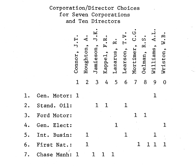
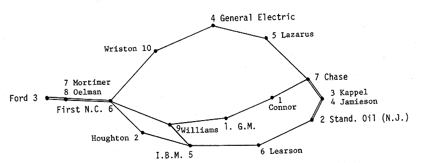
Figure 17. Links between Corporations and Corporate Directors. |
Figure 18. Individual and Corporate Proximities (Levine, 1979). |
Thirteen years later Levine (1979) introduced a tool that could be used to locate points in two mode network data. In two mode data the columns and the rows of the data matrix refer to different objects. And Levine's algorithm allows the user simultaneously to assign locations to points of both kinds: those associated with the rows of a data matrix and those associated with the columns. This procedure has many names, but it is now generally known as correspondence analysis.
To understand how correspondence analysis works, consider the data used by Levine. Figure 17 shows his data on ten individuals each of whom served on the board of directors of at least two of seven large corporations. His aim was to display which corporations were similar in terms of sharing directors, which directors were similar in terms of sharing corporate boards and which individuals were associated with which corporations, all at the same time.
All of these properties are displayed in the pattern of proximities of Figure 18. Note particularly that the two banks are widely separated, as are the two automobile manufacturers. Moreover, each of the manufacturers is associated with a bank. This is exactly the kind of patterning described by Freeman (1968).
The image in Figure 18 was still drawn by hand. But the practice of programming computers to draw point and line images of networks actually began a bit earlier -- in the early 1970s. This development will be reviewed in the next section.
4. Computer Generated Point and Line Images
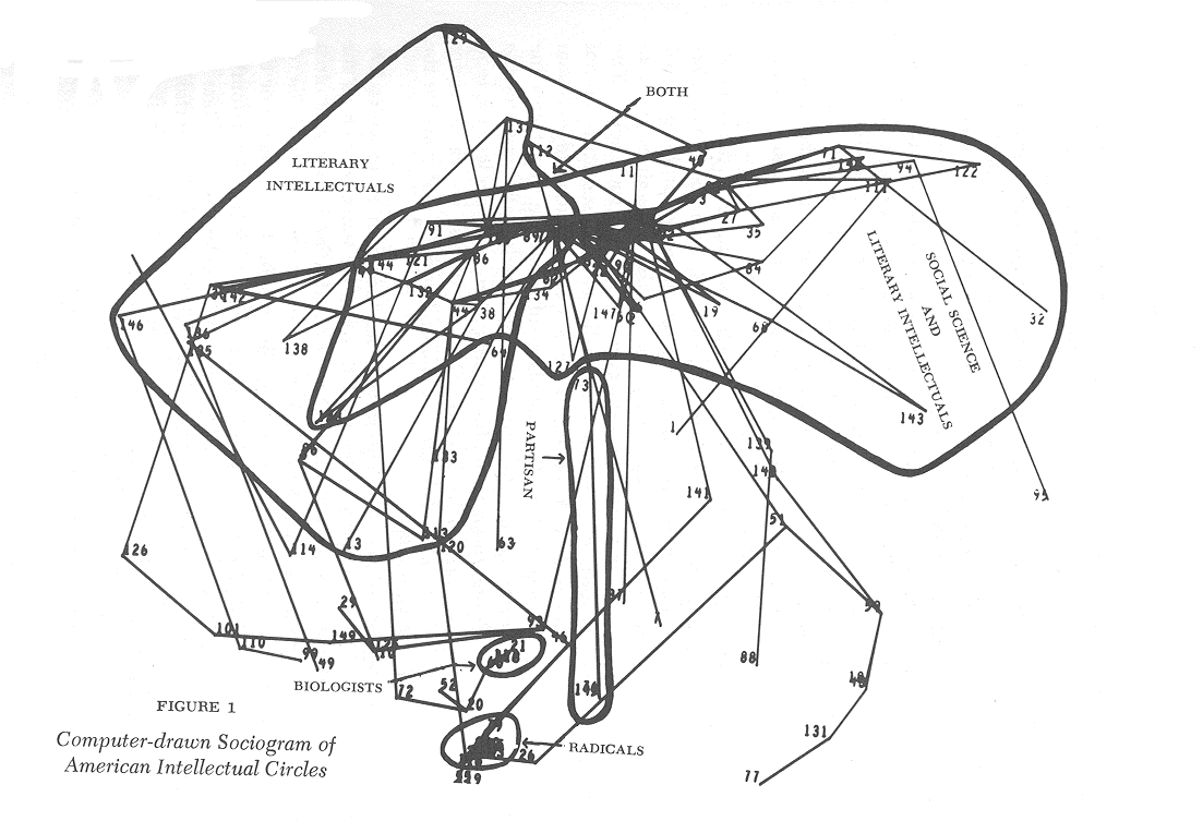
In the 1970s Alba (1972) worked with Gutmann and Kadushin. They developed an early program SOCK that, along with a Stromberg-Datagraphics 4060 plotter, could produce point and line graphics automatically. The program was intended to serve as a general-purpose network analysis and image-producing device. It was used to produce the illustrations used in Kadushin's (1974) book on intellectual elites. Figure 19 is from that book. It shows an image of reported contacts among American intellectuals.
As they were in the image in Figure 16, points here were located by using multidimensional scaling. But, beyond the machine-produced picture, another important innovation was made in this work. The program used one set of calculations to locate the points on the page and it used a second independent set of calculations to designate subgroup memberships. Then subgroups were designated by drawing lines to enclose their members.
When subgroups designated in this way are relatively compact, each of the calculations validates the other. This same kind of approach is now common. Though they used different models for placing the points and for specifying the subgroups, both Webster (1993) and Frank and Yasumoto (1996) produced images that placed points on the page and used an independent computation to specify subgroups.
For the next several years, most programming efforts went into analysis and little attention was devoted to getting computers to draw network graphics (Freeman, 1988). But, in 1978 Lesniak, Yates, Goldhaber, and Richards (1978) described a program that could take output from Richards' network analysis program, NEGOPY, and produce graphic images.
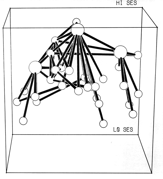
That same year Klovdahl reported adapting ORTEP, an early program designed to produce images of molecules, to the production of network images. Four years later he (1982) published an ORTEP-produced picture. It is shown in Figure 20.
|
|

|
|
Figure 19. Alba and Kadushin's Image of Contacts among Intellectual Elites. |
Figure 20. ORTEP Rendition of the Data of Figures 9 and 10. |
Figure 21. Images of Social Links in Canberra Australia. |
The image shown in Figure 20 is based on Chapin's three-dimensional rendering of the "lady bountiful" data. In 1950 Chapin had to build a physical apparatus to display the image, but 28 years later Klovdahl was able to use a computer to draw a replica of that apparatus in which the perspective cues support the illusion of three dimensions.
Klovdahl then went on to develop View_Net, a program designed to draw elegant images on an Evans & Sutherland real-time graphics workstation. He later moved the effort to a Silicon Graphics work station and developed View_Net II. View_Net II is designed to work with a database and to facilitate the integration of analysis and graphic imaging. It was used to produce the image shown in Figure 21. That figure shows the connections among some of the individuals studied by Klovdahl (1989) in Canberra, Australia. It yields a very convincing three-dimensional illusion and, in that way, it anticipates much of the newer work described below.
All these early machine generated images produced output on plotters. It was not until the late 1980s that the introduction of screen oriented personal computers reduced the reliance on plotters. The production of screen images permitted much more flexibility and, for the first time since Moreno's work in the 1930s, facilitated the use of colors in pictures of networks.
5. Screen Oriented Point and Line Images
I will review six screen-oriented programs here. Two are special purpose programs, programs that do only one job. The other four are designed as general-purpose network graphics packages; they will produce many kinds of images. I will begin with the special purpose pair.
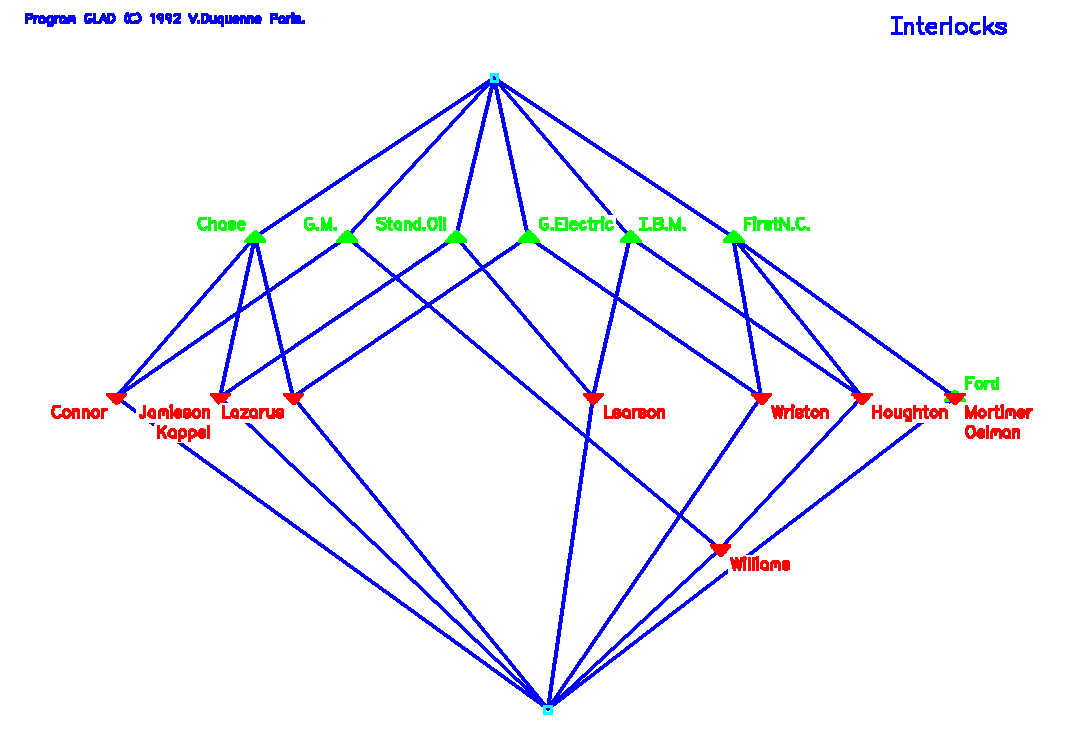
Duquenne (1993) wrote a program called GLAD that is designed to organize network data into a Galois lattice (Freeman and White, 1993). Like correspondence analysis, a Galois lattice is designed to deal with two mode data. But a Galois lattice embodies a completely different approach and it produces a different arrangement of points. It displays an order structure, one in which the dependencies among the row objects, the dependencies among the column objects and those between the two are simultaneously revealed.
Figure 22 displays the Galois lattice arrangement of the data on interlocking directors from Figure 17. It provides a different perspective on corporate structure. First, it should be noted that two sets of directors (Jamieson and Kappel on one hand and Mortimer and Oelman on the other) form structurally equivalent pairs; they are substitutable. But more important, the lattice demonstrates the competition between the two banks; they have no common directors. In addition, it shows that the board member, Houghton, is in some sense less central than Williams: Houghton never serves on a board of which Williams is not a member. Similarly, the Ford Motor Company falls below the First National Bank; Ford has no shared directors with any corporation except First National while First National does share directors with firms other than Ford. It is also clear that most firms and most directors are in the First National or the Chase camp, but not both. Learson is the only director that does not serve on either bank board, and Connor is the only one who serves on one bank board as well as on the board of a company (I.B.M.) that is associated with the other bank. Finally General Electric is the only company that shares a director with both banks. All this reveals a great deal about this corporate structure that is not necessarily apparent in output of the correspondence analysis shown in Figure 18.
|
|
|
|
Figure 22. The Data of Figure 17 Displayed as a Galois Lattice. |
Figure 23. Dynamics of the Freeman and Freeman Data. |
Figure 24. A Rendition of the Image from Figure 23 Using Multicolor. |
I introduced another special purpose screen oriented program to network analysis in a web publication 1997. It is called Moviemol and it uses animation to display dynamic processes. Moviemol runs on PCs (but only under DOS, not Windows), on the IBM-RISC 600 and on any Silicon Graphics work station. Moreover, like many molecular modeling programs, Moviemol is difficult to use in social network analysis. The problem is that the program simply knows too much chemistry. It knows which pairs of points should be connected by lines and which pairs should not. Overriding this knowledge is very difficult. The program displays network data best when all lines are suppressed and the structure is displayed simply by the distances among points.
I can illustrate its use with a data set collected by Freeman and Freeman (1980). The data were collected in the context of an experimental computer conference conducted in the late 1970's. The participants were all separately engaged in research in social networks. They were linked to a common computer that was programmed to facilitate communication through two structures, listservers and an e-mail message facility.
Before the computer connection was started, the participants were asked to characterize each other into one of four classes: 1) close personal friend, 2) friend, 3) acquaintance, 4) someone they had never heard of. Then, after eight months of access to each other via a computer-based communication facility, everyone was questioned again.
Figure 23 shows a dynamic image of the changing patterns through 8 months of computer linkage. After studying the animation of this transition, I was struck by the fact that, based on their patterns of movement, there were four subsets of individuals. I assigned different colors to the members of different subsets. The result is shown in Figure 24, which is simply a replay of Figure 23 with the colors added.
The four subsets turned out to have distinct identities that were consistent with the development of social network analysis. Those who moved up and to the left are the people who became the core of the emerging interdisciplinary field of social network analysis. Those who moved into a cluster at a point in the lower right of the picture are sociologists who viewed network analysis as a small part of sociology and came together to defend the discipline. The two who didn't move did not participate in the computer experiment at all. And the three that moved away at the bottom are three who left the experiment and the network paradigm entirely. Thus, the process of examining the animation suggested looking for this split and the split helped to understand the data.
The four general purpose network display programs that will be reviewed here are Krackplot, Pajek, NetVis and MultiNet. They were all developed at about the same time, in the 1990s. In 1995 Krackhardt, Blythe and McGrath (1995) released a completely screen oriented version Krackplot to the public. That program runs in DOS on a PC. It produces screen images and it can generate good quality printed output. Various algorithms for locating points are included, as are various devices for moving and editing points and changing their shapes and colors.
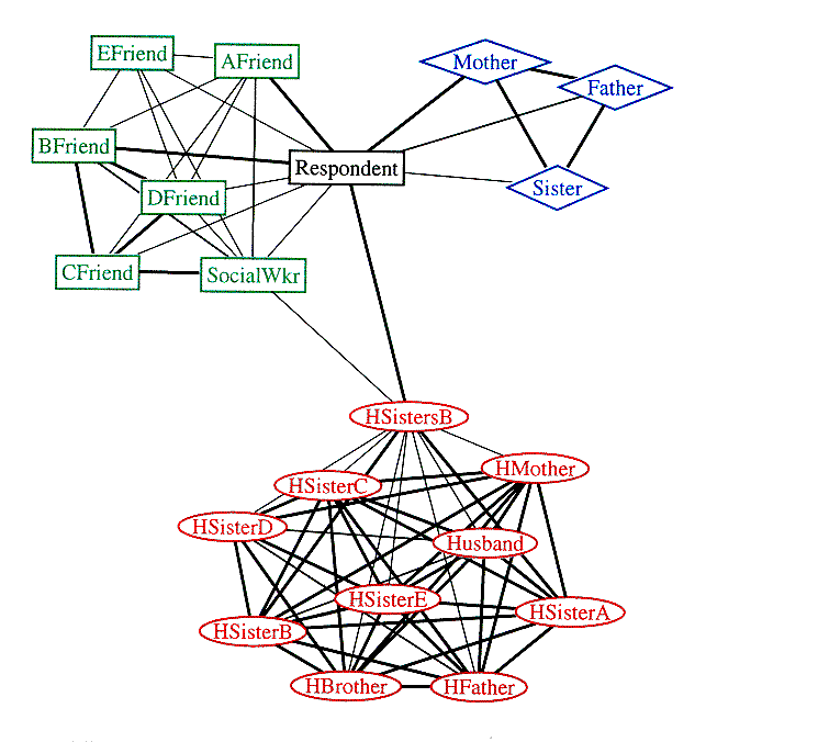
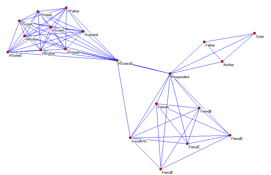
To illustrate the potential of Krackplot, I will use a picture that was published by Mitchell (1994). Mitchell arranged the points into a circle and drew in all the strong and the weak ties surrounding a homeless woman (Respondent). His aim was to stress the fact that the data displayed a structural form in which the actors were broken up into three fairly distinct and socially meaningful subgroups. But, given the circular arrangement of points, the subgroup structure is not immediately apparent.
|
|
|
Figure 25. Mitchell's Image of the Social Support Network of a Homeless Woman. |
Figure 26. A Krackplot Rendition of the Data of Figure 25. |
Consider instead the image of the same data shown in Figure 26. It was produced using Krackplot's standard routines for locating, labeling and coloring points. A spring embedder assigned point locations. Spring embedders are based on the notion that the points may be thought of as pushing and pulling on one another. Two points that represent actors who are close will pull on each other, while those who are distant will push one another apart. Several algorithms have been developed that weight these pushes and pulls in different ways. But they all seek to find a global optimum in which there is minimum stress on the springs connecting the whole set of points.
In Krackplot the user assigns shapes and colors. In this case, the respondent, her friends at the shelter and her social worker are drawn as rectangles. The respondent's rectangle is black and her friends' rectangles are green. The members of her family are shown as diamond shaped and blue. And the members of her husband's family are shown as oval and red.
All these features, especially the locations assigned by the spring embedder make it clear that there are three tightly knit subgroups here. They are bridged by only a few ties, and all but one of the bridging ties involve the respondent.
In 1994, at about the time Krackplot was released, Batagelj and Mrvar released DRAW and ENERG, the first in their series of network drawing programs. This effort culminated in 1996 in the release of the general network analysis and drawing program Pajek (Spider). Pajek includes several algorithms for locating points and it permits the user to move points and to change labels, shapes and colors. Pajek, moreover, can handle really huge data sets and it can locate points in either two or three dimensions. A weakness of its three-dimensional display results from the fact that it produces too few perspective cues to be very convincing as a medium for three-dimensional displays.
Figure 27 shows an image produced by Pajek. It is based on the same data that were used to produce Figures 25 and 26. Although variations in the colors and shapes of points are not used here, they are not necessary, since the tripartite structure of the data is very clearly evident.
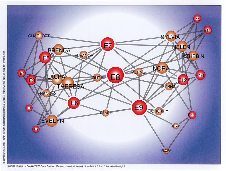
At about the same time, Krempel also developed a general graph drawing program, NetVis. NetVis runs only on a Silicon Graphics workstation. It can locate points -- in two dimensions -- with any of several versions of the spring embedder and it permits the user to modify those locations. Points may vary in their sizes, shapes and colors.
A particularly notable feature of Krempel's program is that it includes a procedure that permits the use of a spring embedder to locate points in two mode data. Like correspondence analysis, this permits the investigator to represent proximities in the data from both rows and columns at the same time. To illustrate, Krempel used data from Davis, Gardner and Gardner (1941) on the attendance of 18 women in 14 informal social events. In his embedder, two events are placed in close proximity if they share many common attendees. Two women are close if they attended many events together. And a woman is close to an event if she attended that event. The result of Krempel's spring embedding is shown in Figure 28. The figure makes it easy to see that the women form two groups and that the two groups are bridged by a few events (E7, E8, E9) that brought members of both together.
|
|
|
|
Figure 27. A Pajek Rendition of the Data of Figure 25. |
Figure 28. Two Mode Data on Womens' Attendance at Social Events (Data from Davis, Gardner and Gardner, 1940). |
Figure 29. A Three Dimensional View of the Brajkovich Data. Get FREE 3D glasses! Email your |
And, still at about the same time, Richards and Seary produced MultiNet, another general program for network analysis and drawing. It can locate points using correspondence analysis or any of several variations of that procedure. It produces two or three-dimensional images and permits users to rotate the images and to color points. A major graphic innovation in MultiNet is that it allows the use of red/green anaglyph glasses to produce the full illusion of three dimensions.
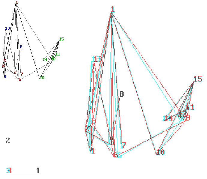
To illustrate, I will use a data set described by Brajkovich (1994). Brajkovich collected data on 15 workers in a small high-tech start-up company. The company included 6 business/management types, 6 engineers, and 3 technicians. Each was asked to report who worked closely with whom. The data reflect the general consensus of all of the workers.
The data were analyzed using a procedure similar to factor analysis based on eigenvectors. The first three dimensions were used to construct the images shown in Figure 29. The smaller image in the upper left corner is a regular two-dimensional projection of the output. It identifies the occupation of each actor. The business types are green, engineers are red and the technicians are blue. That image shows that the managers are clustered together and pretty well segregated from the engineers. The engineers also cluster, and they buffer the technicians from the managers. The technicians do not cluster together.
The larger image on the right reveals the third dimension. If you look at it with glasses in which the left eye is red and the right eye is blue or green, it produces an amazing 3D effect. Points 1, 6 and 11 leap out at you, and points 5, 9 and 13 recede to the back. From this, we can see that the structure is more complicated than it appeared in the two-dimensional image on the left.
Overall, then, these general-purpose programs provide investigators with a wide range of tools for exploring the structural properties of network data. They involve a number of alternative algorithms for arranging points. They facilitate moving points and changing their shapes, their colors and their labels by the investigator.
But these programs are still limited in at least one important respect. Each of them can be used only on one, or a few, particular computers and/or operating systems. This means that they are less than universally available. Anyone who produces an image can mail or email it to others. But the receivers can only inspect it; they cannot themselves manipulate the image in the hope of learning more or of developing a new insight.
Indeed, it was not until the 1990s that the World Wide Web provided an opportunity for the kind of flexibility where viewers can actually interact with the images they receive. Web browsers permit the production of images that can not only be viewed, but also can be manipulated and explored by viewers, regardless of the machine on which they are working. Three of these more flexible tools will be reviewed in the next section.
6. Network Images in the Era of Web Browsers
The advent of the World Wide Web in the mid-1990s revolutionized opportunities for network imaging. Both GIF and JPEG images will be displayed automatically by almost any browser. But many newer programs intended for browser application are somewhat less than universally adaptable. Some browsers will automatically support a given display program, while others will not. And in some cases a browser will be able to support a display program, but it will require that a "helper" application be downloaded before an image can be displayed.
For these newer display programs, therefore, I will present figures in pairs. In each case, the first of a pair will present the image in a form that is more difficult to display. The second will approximate the first in the form of a PowerPoint slide show. I encourage viewers to use the first of each pair whenever they can. The second will always provide a less dramatic collection of images.
Program developers working in social networks have been relatively slow to adapt to this revolution. But a student at the University of Illinois, Michael Chan, has produced a Java program that was designed specifically for application to the analysis and display of social networks. His program is a weighted spring embedder. It takes as input data that record the strength of the edge connecting each pair of points. It uses these strengths to assign optimal lengths to hypothetical springs linking each pair. Then it seeks to find a way of locating all the points such that the overall tension on the collection of springs is minimal.
To illustrate Chan's program, I will return to the Davis, Gardner and Gardner data shown in Figure 28. Here the data have been converted to a one mode (woman by woman) form in which each cell contains a record of the number of events co-attended by the row woman and the column woman. These numbers, then, provide an index of the strength of the connection between each pair of women. They are the input for the Java program displayed in Figure 30A. That program permits the viewer to arrange the 18 women randomly, in a circle or using Chan's spring embedder to seek an optimum display. If your browser will not display Figure 30A, you might want to download a newer browser, or you can see some of the same images by looking at Figure 30B.
|
|
|
Figure 30A. JAVA Image of Spring Embedding the Data Displayed in Figure 28. |
Figure 30B. PowerPoint Slide Show (selected images). |
A second browser-based way of handling images is provided by VRML (Virtual Reality Modeling Language). Though VRML is probably not as ubiquitous as Java, VRML files are handled automatically by most recent browsers. And if your browser lacks the ability to interpret VRML, it is relatively simple to download a free interpreter and attach it to your browser. After that, any VRML file can be displayed on your computer.
VRML provides elegant visual images and a convincing illusion of three dimensions. It allows the viewer a wide range of ways to manipulate the image. You can expand or shrink it. You can rotate it in any direction, pan around it, tilt it or slide it in any direction. You can, moreover, move away from the image or even move into it and right on through it. It takes a while to get used to VRML controls, but once they are mastered, VRML provides great flexibility.
A VRML image of data collected by Webster (1994) is shown in Figure 31A. This image is a three-dimensional representation of data on friendship ties collected at a residential college at an Australian university. All 217 residents were interviewed individually and asked to name their friends within the college. The residents were also asked to indicate the strength of each friendship tie. The original matrix was symmetrized, then analyzed using correspondence analysis. The first three axes of the correspondence analysis were used to locate points in the picture presented here.
If your browser will not display the image in Figure 31A, you can download a helper application from this address, install it and try again. Or you can see three snapshots from the VRML image in Figure 31B.

|
|
|
Figure 31A. VRML Image of Webster's Australian Friendship Data. |
Figure 31B. PowerPoint Slide Show (selected images). |
You will probably have to expand or shrink the image of Figure 31A to see the whole of it. You will notice, then, that it has an interesting pattern. When it is rotated, it displays four wings that are projected out and seem to be made up of individuals who are not part of the central core. Webster set out to identify these wings.
In a separate analysis, she uncovered 19 friendship groups by extracting cliques and merging those that displayed major overlaps. She used her ethnographic knowledge to name these groups. The members of four of the 19 clique-clusters turned out to anchor the four wings. They are displayed through the use of colors assigned to the points in the figure.
The RELIGIOUS group shown in yellow is a devout group of residents. They are bipolar with the mostly male GRUNGE group (identifiable by their disheveled appearance) who are shown in silver. The MATH HEADS are colored purple. They are bipolar with a very social group (colored light blue) that Webster dubbed THE WOMEN. The fact that there is agreement between the two independent analyses, then, argues for the validity of both.
Finally, the third browser-based display program, MAGE, is unlikely to be found already installed on your machine. But its strengths are great enough that it is worth the effort of downloading it from here and installing it as a helper application. Once it is installed in your browser, MAGE will be automatically mobilized whenever an appropriate image is loaded.
MAGE was originally designed by Richardson and Richardson (1992) for viewing and manipulating the images of protein structures. It is a very small program. But it is flexible and it is exceptionally easy to use. It simply draws images and does not impose any restrictions based on its knowledge of chemistry. It requires input in a simple format, called kin. At a minimum, a kin file requires a three-dimensional list specifying x, y and z locations for each point.
The creator of an image can draw points and lines, use color and present the viewer with any number of preset views. But the viewer has options for reading and saving files, changing pictures, changing viewpoints and the like. In addition there are three scroll bars on the right side of the screen. With them, the viewer can control the zoom factor, depth clipping of the image and the display of layers of complex images.
Once you have installed MAGE you will be able to view the image shown in Figure 32A. The figure will show a series of images that were part of a computer-based demonstration of MAGE by Freeman, Webster and Kirke (1998). You can move through the series by clicking on the box marked "ANIMATE" on the right of the screen. Note also that by moving the cursor in the screen you can explore different views of the image on the screen.
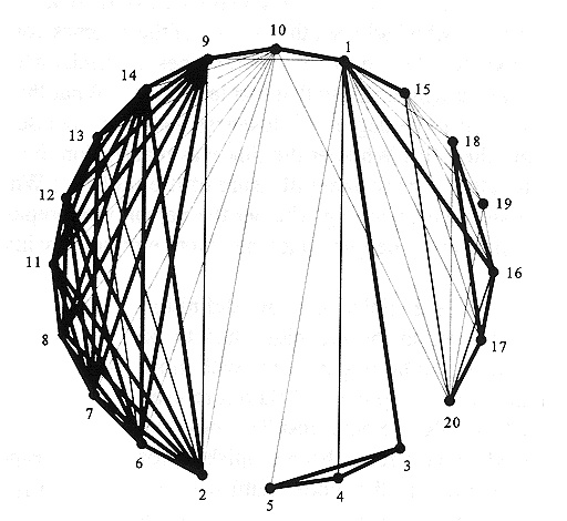
Kirke (1996) collected data on friendship ties among teenagers in a Dublin suburb. In the first slide, points were arranged using multidimensional scaling of the original data as reported by Kirke. The remarkable feature of this arrangement is the long cycle running completely around the circle of points. But the presence of that cycle turned out to be the result of the fact that the data included a combination of two distinct relations, friendship and sibling ties.
In the second image only the sibling ties are shown (in blue). The third image, then, shows only the friendship ties (in gold) and demonstrates that the cycle is absent. The fourth slide distinguishes between males (in green) and females (in red) and it shows both the (blue) sibling ties and the (gold) friendship ones. Finally, the fifth slide shows the results of a new multidimensional scaling -- this time restricted to just the friendship ties.
This fifth slide shows many interesting structural features of the data. The males form complicated clique-like structures. The females form trees, without cycles. Any male can reach any other male through an all-male chain. Members of the two collections of females must rely on males to be linked.
|
|
|
Figure 32A. MAGE Image of Kirke's Data on Friendship among Dublin Teenagers. |
Figure 32B. PowerPoint Slide Show (selected images). |
7. Conclusions
Overall, this review of the use of graphic imaging in social network analysis points up a number of interesting trends. Perhaps the most central is the clear indication that imagery has, and has always had, a key role in network research. From the beginning images of networks have been used both to develop structural insights and to communicate those insights to others.
Most early images were constructed by the application of ad hoc rules. As time passed, however, images have increasingly been constructed by applying standardized procedures for placing points in first two, and later in three-dimensional space. Early applications used factor analysis. More recently, factor analysis has been replaced by various forms of scaling, particularly principal components and correspondence analysis. And, just in the last few years, various forms of spring embedders are increasingly used to place points.
Computers have been used to do the actual drawing for a number of years. But, more recently, the network research community has shown a tendency to construct and share screen-based images instead of relying entirely on the production and distribution of printed pages. This new approach facilitates the use of color and animation. Currently it offers enough flexibility to allow viewers to begin to interact with the images they receive.
Network analysts have always been able to learn by generating and sharing visual images. Modern technology promises to enhance our ability to learn from images by continuing to provide new tools that allow for more powerful visualizations. Electronic journals like the Journal of Social Structure provide a case in point. It is obvious that a great many of the images provided in the present JOSS article could not have been included in a standard print journal. We are entering a new era in which we can use color, animation and three-dimensional imagery to explore social structural arrangements.
Future developments will undoubtedly extend current trends. Network analysts already have made considerable progress in developing programs for computation (Freeman, 1988). And, as I have shown in this paper, we have made progress in developing programs for visualization. We can look forward to similar progress in developing database programs designed to facilitate the storage and retrieval of social network data. But the real breakthrough will occur when we develop a single program that can integrate these three kinds of tools into a single program. Only then will we be able to access network data sets and both compute and visualize their structural properties quickly and easily.
References:
Alba, R. (1972). SOCK. Behavioral Science. 17, 326-327.
Arnheim, R. (1970). Visual Thinking. London: Faber.
Bock, R. D., and Husain, S. Z. (1952). Factors of the tele: a preliminary report. Sociometry. 15, 206-219.
Brajkovich, L. F. (1994). Sources of social structure in a start-up organization: work networks, work activities, and job status. Social Networks. 16, 191-212.
Chapin, F. S. (1950). Sociometric stars as isolates. American Journal of Sociology. 56, 263-267.
Davis, A., Gardner, B. B., and Gardner, M. R. (1941). Deep South. Chicago: The University of Chicago Press.
Duquenne, V. (1993). GLAD. Paris: C.N.R.S.
Festinger, L., Schachter, S. and Back, K. (1950) Social pressures in informal groups: A study of human factors in housing. New York: Harper.
Frank, K. F., and Yasumoto, J. (1996). Embedding subgroups in a sociogram: Linking theory and image. Connections. 19, 43-57.
Freeman, L. C. (1968). Patterns of Local Community Leadership. Indianapolis: Bobbs-Merrill.
Freeman, L. C. (1988). Computer programs in social network analysis. Connections. 11, 26-31.
Freeman, L. C., and Freeman, S. C. (1980). A semi-visible college:structural effects on a Social Networks group. In M. M. Henderson, and M. J. MacNaughton (Eds.) Electronic Communication: Technology and Impacts. (pp. 77-85). Boulder, CO: Westview Press, Inc.
Freeman, L. C., and White, D. R. (1993). Using Galois lattices to represent network data. In P. Marsden (Ed.) Sociological Methodology 1993. (pp. 127-146). Cambridge, MA: Blackwell.
Hage, P., and Harary, F. (1983). Structural Models in Anthropology. Cambridge: Cambridge University Press.
Kadushin, C. (1974). The American Intellectual Elite. Boston: Little, Brown.
Kirke, D. M. (1996). Collecting peer data and deliniating peer networks in a complete network. Social Networks. 18, 333-346.
Klovdahl, A. S. (1981). A note on images of networks. Social Networks. 3, 197-214.
Klovdahl, A. S. (1989). Urban Social Networks: Some methodological problems and possibilities. In M. Kochen (Ed.) The Small World. Norwood, NJ: Ablex.
Koestler, A. (1964). The Act of Creation. New York: Macmillan.
Krackhardt, D., Blythe, J., and McGrath, C. (1995). KrackPlot 3.0 User's Manual. Pittsburgh: Carnegie-Mellon University.
Laumann, E. O., and Guttman, L. (1966). The relative associational contiguity of occupations in an urban setting. American Sociological Review. 31, 169-178.
Leonard, O., and Loomis, C. P. (1941). Culture of a Contemporary Rural Community--El Cerrito, New Mexico. Washington, DC: U.S.Department of Agriculture.
Lesniak, R., Yates, M., Goldhaber, G. M., and Richards, W. (1977). NEGOPY and NETPLOT, Program Characteristics. Connections. 1, 26-29.
Levine, J. (1979). Joint-space analysis of "pick-any" data: Analysis of choices from an unconstrained set of alternatives. Psychometrika. 44, 85-92.
Loomis, C. P. (1946). Political and occupational cleavages in a Hanoverian village. Sociometry. 9, 316-333.
Loomis, C. P. et al. (1953). Turrialba--Social Systems and the Introduction of Change. Glencoe, IL: Free Press.
Lundberg, G. A., and Steele, M. (1938). Social attraction-patterns in a village. Sociometry. 1, 375-419.
Mitchell, C. (1994). Situational analysis and network analysis. Connections. 17, 16-22.
Moreno, J. L. (1932). Application of the Group Method to Classification. New York: National Committee on Prisons and Prison Labor.
Moreno, J. L. (1934). Who Shall Survive? Washington, DC: Nervous and Mental Disease Publishing Company.
Moreno, J. L. (1953). Who Shall Survive? Beacon, N.Y.: Beacon House Inc.
Northway, M. L. (1940). A method for depicting social relationships obtained be sociometric testing. Sociometry. 3, 144-150.
Northway, M. L. (1952). A Primer of Sociometry. Toronto: University of Toronto Press.
Pitts, F. R. (1979). The medieval river trade network of Russia revisited. Social Networks. 1, 285-292.
Proctor, C. (1953). Informal social systems. In C. P. Loomis, J. O. Moralis, R. A. Clifford, and O. E. Leonard (Eds.) Turrialba. (pp. 73-88). Glencoe, IL: Free Press.
Richardson, D. C., and Richardson, J. S. (1992). The kinemage--a toolfor scientific communication. Protein Science. 1, 3-9.
Taylor, A. M. (1971). Imagination and the Growth of Science. New York: Shocken.
Tufte, E. R. (1983). The Visual Display of Quantitative Information. Cheshire, CN: Graphics Press.
Tukey, J. W. (1972). Some graphic and semigraphic displays. In T. A. Bancroft (Ed.) Statistical Papers in Honor of George W. Snedecor. (pp. ). Ames: Iowa State University Press.
Wasserman, S., and Faust, K. (1994). Social Network Analysis: Methods and Applications. Cambridge: Cambridge University Press.
Webster, C. M. (1993): Task-related and context-based constraints in observed and reported relational data. Ph.D. Dissertation, University of California, Irvine.
Webster, C. M. (1994). A comparison of observational and cognitive measures. Quantitative Anthropology. 4, 313-328.
Wolfe, A. W. (1978). The rise of network thinking in anthropology. Social Networks. 1, 53-64.